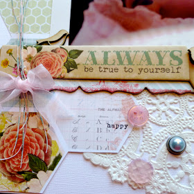
As
part two of my contribution to the Counterfeit
Kit Challenge countdown to Christmas, I 'm back today to share my
scrapbooking process with you (or one of my processes anyway).
We all
took this different directions and I decided not to link it up to the page kit
I shared with you yesterday, but rather to follow myself as I made a layout and
notice the decisions I made and the thought process I went through to come to
the end result.
Now this
is a LONG post so I have reduced it down a little. But you can find the full
post over at the Counterfeit Kit Challenge blog today.
The
layout comes from the prompt over at Whimsical
Musings to be inspired by babies.
My
starting point was a photo that just shouted out to be scrapped of my new
niece. Knowing I wanteded to base my design on white cardstock gave me a good starting point for me to then go to my piles of stash and start picking
out anything that spoke to me. Before long I had a half dozen or so sheets of paper or scraps that
seemed to go together. I laid them out and added a few embellishments to the
pile so I could see what would work together. A few papers got taken out
straight away and in the end, I only used a few of those selected.
The next step for me is to lay out some paper blocks
to see how the colours are combining and to estimate the layers I want to
incorporate. I just cut up blocks of paper and only then work out how
and where to put them. I
lay out the papers on the page to see them together and then added a few of the
embellishments. My process is very fluid! As ideas hit, I just fish out the products from my stash and add them to the pile.
At this point, nothing is attached so I picked everything up and started gluing down, lightly pressing
them down until I know that the position is correct. When everything looks
about in the right position, I flatten all the items down with my hand to fix
them all.
Next up comes the photo and the beginnings of my
embellishments, usually placed in small, dimensional clusters, and very often
forming some sort of a visual triangle or diagonal across the page.
It’s now that I start rummaging around in my stash for
extra little items to add in to my clusters.
For this layout I continued to poke around on my desk
and discovered some washi tape before I looked through my alphabets for something that would be
suitable. I knew I wanted to write a long title but wasn’t sure what or where.
When I came across these small BG letters, I knew they would be perfect due to
the large number of letters on each of the sheets. I did this title back to
front, starting at the bottom with the last word and working back to the
beginning of that phrase before deciding how the title should start (wording)
and where I would put it. That is another reason I like the current trend for
small letters so much: it doesn’t restrict me so much and I can usually find a
small corner to squeeze in these words.
One of the issues with creating the page like this is
that there’s been no planning for my journaling! However, for this layout, I was
lucky as the photo is the main focus, the title is long and says a lot and
therefore the journaling was almost not needed. But I don’t make many pages
with no journaling at all, so I got out some rough paper and jotted out a few
lines until I found something a bit more than, “You are gorgeous and I love
you”! Then I copied this into the small corner I’d picked out and was relieved
to find it fitted in.
Now it’s time to step back and have a look to see if
everything is working ok together. I check for balance, for colours, for
crooked letters (although they are always a bit crooked!), for if something
else is needed to add a little extra.
So there you have it, a typical page following a
typically chaotic process for putting it together. I hope you enjoyed this
little insight to my rather disorganised brain.
Again, there's a bit more detail over at the Counterfeit site if you'd like to read the whole thing.
Now, all that's left is for me to wish you all a very Merry Christmas everyone!


Very pretty page and really interesting to see how you put it together ... Though you say it's chaotic, it looks very logical and thought-through from here! Wishing you a very happy Christmas and New Year.
ReplyDeleteThis is GORGEOUS! I love that MME line, and the wood veneer, and those paper strips are such a cool embellishment! TFS! =)
ReplyDeletesuch a lovely page! love the soft colors and seeing your process!
ReplyDeleteWhat a stunning layout, Lisa!! I am so looking forward to another year of CKCB inspiration from you!
ReplyDeleteso very very pretty
ReplyDeleteWhat an absolutely sweet layout! The pastels were gorgeous and I look forward to working with you on the team!
ReplyDelete