Monday, 17 January 2011

Me in 2010 (2010 in Review pt 4)

I can't say that I looked my best in 2010. 

Too many extra kilos ignored, far too many new grey hairs that I was too lazy to cover up most of the time, too little time spent on looking after myself. In fact, when it comes to me, I am pretty lazy! I have my fair share of vanity, but more often than not, the laziness wins out! LOL. But I thought it would be interesting to see what I looked like through the year - hair, wrinkles, clothes, smiles? So, maybe this is a vain 2010 review but I think we often don't look at ourselves enough. I try to get plenty of photos of me as I scrap a lot about me (if I don't, who would?!) but I can definitely see that this year was limited as far as photos of me, and photos of me and those people around me. Anyway, here are a few that stood out.

1. Mum's special day. When I look at photos like this, I struggle to find any resemblance at all. This photo especially, makes us look like day and night! 


2. Me at the coal mine. I was surprisingly clean when we arrived back on the surface after three hours more than a kilometre underground. But boy, the dust was everywhere! The shower water was black and it took days to get rid of the last fragments of dust from my nails and (horror) up my nose!!! A wonderful experience which was worth the dirt. Can you tell how utterly exhausted I was?!


3. Halloween. I tried extra hard this year to come up with a "good" costume for myself! I even planned it a bit, although I only put it together about an hour before our guests arrived! I had seen something on the Martha Stewart website which inspired me with the face make-up and just built on that. I was very pleased with the result although my trailing veil proved a bit of a health and safety hazard!


4. Just me. This was probably one of those 12 on 12's self-portrait photos (check out the mess in the background!). It's not pretty, not posed, not really edited and therefore, it's pretty real. Actually, I like the colour of my eyes here and so many freckles! 


5. A girl and her camera. I see these photos so often online so I tried to replicate them - with limited success! Rather wild, grey hair but this represents what I looked like for most of the year!


6. Classic Cosmo. Christmas Eve, Cosmopolitan in hand, silly paper hat on head, dinner with the love of my life. Who could ask for more?


7. New Year's Eve. We dressed up. The others came in jeans. It was a lot of laughs and I got to wear my wonderful Cadbury's dress (so named because of the gorgeous jewel purple colour of the dress which is very similar to the royal purple that Cadbury's use for their trade mark Dairy Milk bar of chocolate!) After a pre-Christmas trip to the hairdresser, my fringe is back and that makes me happy. Little things, huh?!


8. Faded me. Another 12 on 12 self portrait which looked so serious that it came to appear on at least one of the more serious layouts I did this year. I have to work on smiling more this year.


9. Hiding behind the camera. Another attempt at the photo in the mirror with camera type shot. I like this one better because the camera is hiding most of my face!


10. Just the two of us. I noticed that we didn't take so many of these types of photos last year - need to improve on this in 2011.


I think it's really important that I feature in our photos of our life. Last year, I forgot this a bit and when I look through 2010, there really aren't enough. And there certainly aren't enough of the two of us. This will be added onto my list of things to remember for 2011.

Try looking back on your own photos of you in 2010. What can you tell about yourself from them? 

Saturday, 15 January 2011

Goodies for my never ending wish list!

I interrupt our normal schedule to bring you this important "Lisa's wish list has grown to gigantic proportions" report!

It's that time of year again - CHA winter - and I have been seeing some enticing sneak peeks here and there across the blogosphere.

Here are a few things that have caught my eye:

Echo Park - What fantastic bright colours and designs - Of all I have seen so far that I have loved, this one made me stop and gawp - big time. I adore this. I really think this is one I am going to have to get.


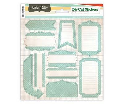
Studio Calico - the ranges looks interesting but this paper is lovely and they have great sets of journalling labels in all their new collections 

State Fair

Countryside


Tim Holtz 

More wonderful Sizzix dies - not that I have any of the older ones either! A girl can dream!

This one definitely has my name on it!

My Mind's Eye

MME have done it again and come up with loads of products that appeal to me - it could be all the soft colours or the wide range of different items in each collection, but I find myself reaching for MME again and again.


Good Day Sunshine Girl - lots of pretties in this collection - soft summer colours which look great together


Good Day Sunshine Boy - not so many papers here for me, but I do like this one


Stella & Rose Gertie


Stella & Rose Hattie


 Prima

So many wonderful new flowers, leaves, trinkets and just all round lovely stuff!


Pink Paislee

The more I see of their stuff, the more I love it.


What has been catching your eye in the sneaks?

Friday, 14 January 2011

Top 3 Classes - and a half (2010 in Review pt3)

Over the year, I did my usual signing up for more classes than I could really deal with! At BPC I took 6 classes, received prompts from Shimelle's LSNED and JYC (you are automatically in the class each year it runs once you have joined the class for the first time), and also joined in various challenges including LOAD. I was successful (!) to a greater (at times when I was über-motivated) or lesser extent (due to my own laziness or lack of concentrated effort), and only really completed one of the classes from beginning to end but I did manage to complete a layout every day for the three months of LOAD (February, May & October) which I am very proud of. A pile of 90 layouts is really something I can tell you! Some of my favourite layouts of the year (to come) came from these classes and from LOAD - they filled me with inspiration and motivation.

My Top 3 Classes of the year were therefore:

1. Dimensional Details by Nic Howard (BPC)

If you are at all familiar with Nic's work (she is on the design team at BasicGrey and also Prima) you will know that she is all about the clustering, distressing and dimension. Originally, I wasn't sure but she was so highly recommended on the LOAD message board that I signed up and it was FANTASTIC. You have to get on board if she ever runs this class again. Every week was stunning: full of inspiration and beautiful layouts as well as great assignments and clear, motivational instructions. I loved every minute of it and completed every assignment which is a real achievement for me. It's really hard to pick a favourite layout from this class as I truly love them all but this one was so much fun to do.

Through this class, I really feel as though I have found my style and that feels great. I love the curled edges and the piles of embellishments and the paint and ink and bits and pieces. I have no idea how I will get them all into albums due to their dimension but I don't care! I haven't put a single layout into an album for more than 18 months and just adore sitting looking at the huge piles of finished layouts I have.


2. Colour! or is it Color? by Nic Howard (BPC)

Once you've done a Nic H class, it will have you coming back for more! She is delightful and fun and inspiring and has a wonderful NZ accent which we all love. She produces just the most gorgeous layouts and has a style all her own (which I want for myself!!). So when this class came up, it was a no brainer for me. Ok, so I haven't managed all the layouts yet but I am working through the assignments in my own time and loved the first couple that I did. As you might have guessed, this class was all about colour and we went through the colours of the rainbow to create a collection of cards and layouts that represent each colour considering the meanings behind each colour and thinking about the mood or feelings they can represent. I just finished green last weekend (so 2011) but managed red and yellow last year. Yellow is therefore my layout of choice to represent this class.


3. Camp Scrap by May Flaum (BPC)

May offers a completely different style of class but is so much fun. The pace is faster. There are always loads of examples, assignments, challenges, handouts, chats and giveaways. She has a great style and loves to make simple but quirky layouts using mostly 6x4 photos either complete or cropped down which I love. Most of her layouts are multi-photo (now there's a topic for a blog post ;-)  ) and are easy but effective. She's not a perfect scrapper which suits me down to the ground. Camp Scrap was a summer class with all the fun of, well, camp! Ok, many of us non-US'ers didn't really know what happened at "camp" but it was all good stuff and we had a ball. Again, I didn't do all the assignments but that's the joy of lifetime access: I can go back over the ones I missed and fill in. I completed 8 specific challenges or assignments but this one of Charlie is my favourite for sure.


And I am going to add in a 3a which would be the October LOAD - it was a wonderful 31 days and I have 31 wonderful layouts to prove it. Check out the link above to find out about LOAD 2/11 and I promise you, you won't regret joining up - if you complete 28 or just 2 layouts! I will be blogging more about LOAD later in the month but this was one of my favourite LOAD layouts where I followed the prompt (purely optional and sometimes I do, sometimes I don't).


Are you a classaholic like me? If so, what is your favourite - I'd love to check it out.

I am currently *shock horror* classless but am planning to join May Flaum again at BPC for her Creative Retreat 2011 starting in Feb - it might be crazy to join at the same time as LOAD, but heck, I am just a crazy girl sometimes ;-)

Wednesday, 12 January 2011

Top 3's, 5's & 10's (2010 in review pt2)

Even though I was glad to say goodbye to 2010, when I was thinking about the year as a whole, there were many highlights which is always great to realise. Sometimes, when you are in the middle of it, it's difficult to see the positive and hindsight then becomes a wonderful thing.

And so, on I go to the first batch of top #'s (all featured in no particular order)

Top 10 Events of 2010

  1. The Chances visit Germany. Always a treat to have them all over here. We fitted loads into just a few days but the highlight was definitely getting us all on the same photo.
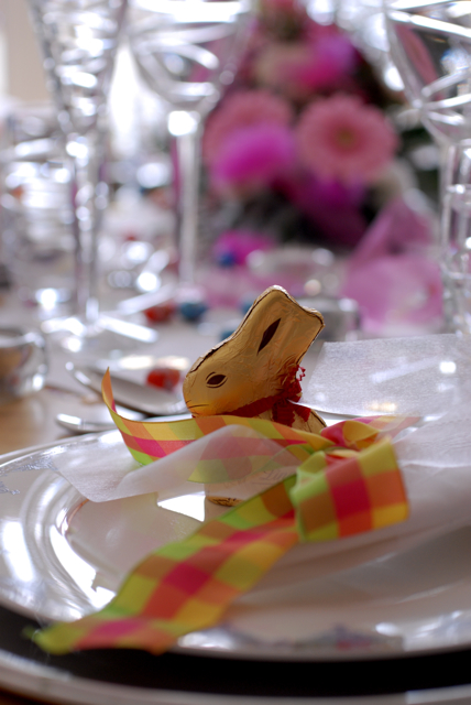
  2. Easter.  What a surprise, a totally pink affair full of prettiness. It's such a great time of year to decorate the place with glitter, flowers, feathers, eggs and pretty, pastel colours. So very me! It's a great way to welcome the spring.
  3. Our trip "Untertage" (or us down a coalmine!). A life-changing experience which I know sounds a bit exaggerated but it was a spectacular adventure that gave me a much greater sense of respect for those who work (or have worked) underground.
  4. Liberty and I taking mum for Prêt à Portea at the Berkeley Hotel in London for her birthday present. A fashion collection inspired afternoon tea followed by Mama Mia in the West End. It was lovely to spend the day together and I think we all enjoyed ourselves so much and had a lot of laughs. My favourite delicacy was the Chanel shoe - what a classic.
  5. My brother-in-law's wedding to the wonderful Elke. Ok, so I didn't want to post a photo of them here as I haven't asked their permission but they set up a self-portrait corner for the guests to have a bit of a laugh and we spent five minutes there taking some silly photos. Silly being the operative word! If you know us, you know that is not hard for either of us!
  6. Mum's visit to Germany for my birthday. I blogged about it but it was lovely to have her here for my birthday and to check out three Christmas Markets in as many days. We never find ourselves together in a photo so I was especially pleased with this one. 
  7. The World Cup in South Africa and Germany coming third. I did support England through the fírst stages until they lost against Germany (an ever so slightly awkward moment!) but then it was all out to cheer on the German team to their well-deserved third place. It's hard to support England over here (!) but at least I get a bit of the best of all worlds in being able to support them both. (And I am really NOT a big football fan - once every four years only).
  8. Surprise flowers from a very special friend. I wrote about reconnecting with a wonderful schoolfriend earlier in the year. We hadn't seen each other for 9 years (since I moved to Germany) and I went to vist her in May. We chatted and laughed and caught up as if we hadn't been apart all that time and then she surprised me with these beautifully thoughtful flowers to let me know she was thinking of me. Good friends are so hard to find and it's one of my resolutions this year to do better at keeping my friends in my thoughts and to keep in touch more regularly. 
  9. Halloween. This year I really went to town on the crafting and decorating for Halloween and was thrilled with the result. We had our usual small party with family and friends complete with very ingenious costumes and it was a lovely, relaxed evening. 
  10. 24 hours in Hamburg with Ted. My first time to this very beautiful port city and even though we were there for such a short time, and we kept to a real budget, we managed to see the main highlights of the city. It's really a lovely place and I hope to go back one day with R to look around in more detail. A very successful weekend.

    Tuesday, 11 January 2011

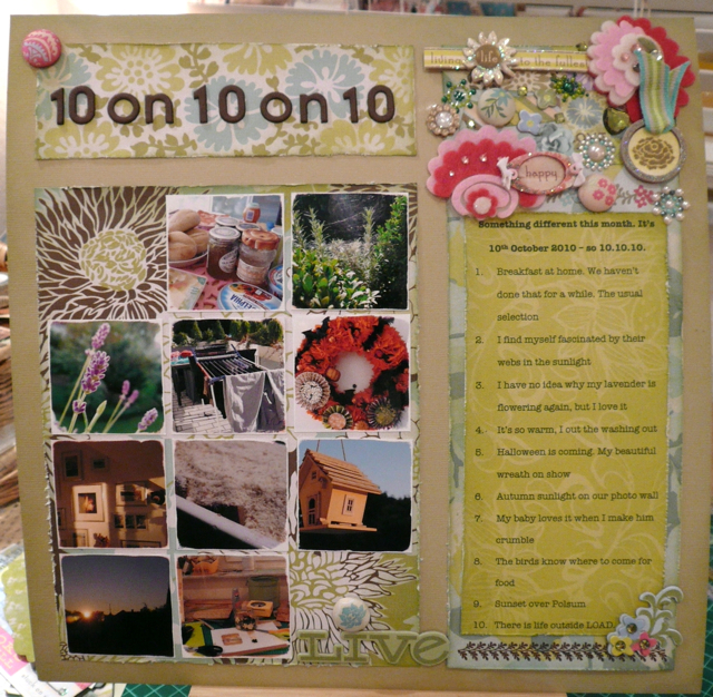
    Multi-photo layouts (part 2)

    So enough of the philosophising last week.

    Next I want to show you what options you have with multi-photo layouts.

    How do I actually get all those photos down once I have decided that I NEED to use 3 or 6 or even 12?!?


    I need to make two decisions at the same time.

    • What type of layout do I wish to create? 
    • What size of photos do I want to use? 


    What type of layout do I wish to create? 

    This relates to decisions such as do I want a double spread or just a single page?


    Do I have lots of journalling to fit in as well as the photos?


    Do I envision it as a more arty layout?


     Or more graphic?


    Are the photos the main focus...


     or is the story the focus?


    What size of photos do I want to use?

    Often, I just want to use the photos that I have already printed which will probably be in a 6x4 format. So I can leave them as they are which of course is a little limiting on a single page, or I can trim them down a bit, maybe just half an inch so that I get a bit of a margin around the photos.


    Or I can chop them up completeley which is actually something I love doing. Very often, the photo itself can be greatly improved by cutting it down to focus on just the main feature of the photo.


    I love the 1" or 1 1/2" strips that have featured in seveal of my layouts and think about how many of those you can fit onto one layout!


    Of course, the other option I have is to print them out in a smaller format which I do quite often and I'm lucky to have a great photo printer and also some good photo editing software that helps me with standard small format printing (2x2, 2x3 or 5x3) or real photo cropping and then printing in any size I want.


    (Disclaimer: I never cut up an original photo unless I have a digital back up on the computer. In fact, I hardly ever even scrap an printed photo unless I have a digital back up regardless of if I need to crop it down or not. If it's a "vintage" photo, then I always scan it first and then print off the scan leaving the original to be put into a standard photo album - ie. any pre-digital camera photo will always be scanned and used in this way.  Original photos are too precious to me to cut up and scrap in this way. They really are irreplaceable.)


    All of these things are going round my mind while I am looking at my products and photos on the table. I move things around, think about it, look at the photos, consider the story, pick up and put down product until I have a plan!

    Next week will be the final piece of the puzzle - what design tips can help the layouts to work with so many photos. And what mistakes I sometimes make! 

    Do you use any of these ideas when thinking about your design? What is your "favourite" way to approach the whole multi-photo problem?

    LinkWithin

    Related Posts Plugin for WordPress, Blogger...