Monday, 4 July 2016

July at Scrapabilly #1

The July Scrapabilly Kit des Monats is a stunner featuring Beach Day papers and elements by Carta Bella.


Bright, sunshine filled papers perfect for beach, holiday, garden or even cocktail layouts (see my Whimsical Musings post here) with matching embellishments for adding a little extra to your page. 


There's even a cute matching pineapple washi tape which I decided that I had to have as an add on for the kit,


as well as the collection enamel dots,


and the pack of die-cuts - ideal for layering up or as a journalling spot.


The kit and the full Beach Day range can be found in the Scrapabilly shop here.

As soon as I saw that pineapple design paper and all the tropical items, I knew I would make a layout or two about my time in the Philippines. I also knew that I wanted to use the Silhouette as much as possible. So I combined all three here on this page about our time in El Nido resort in Palaawan.
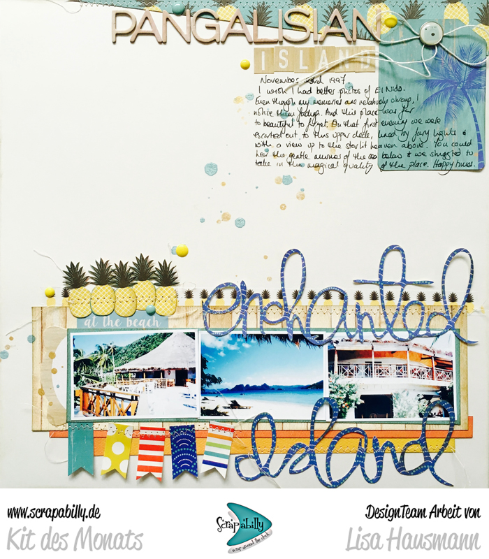

This page tells the story of our first evening on the island and being taken out on to the fairy-light-lit deck for an unforgettable evening under the stars. I don't have any photos of that first meal so I just used a few daytime shots to support the story I wanted to tell. In fact, I have very few photos of these few days so no doubt I've already used one or two of them already on other layouts!


I really enjoy getting a little dimension onto the page by just attaching a loopy title along the middle allowing either side to lift a little off the background.


This next layout was in fact the last layout I made with the kit and used up all the last scraps of paper in one of my go-to designs of a layered-up, four-way grid.


It was fun to find ways to include little items out of the die-cut pack and stickers to just add some playful elements. Apart from the kit and the extras I added in from the range itself, the only additional items I used were a little thread and some mist.


Head over to the Scrapabilly shop to grab your own kit and while you're there, you can find all the creations of the whole Design Team - including the Schick Schnack Sack and the Pretty Planner Pack teams - in the July gallery here.

Friday, 1 July 2016

Counterfeit Kit Challenge July kit reveal blog hop

Can you believe that it's July already and that half the year is already over! Stop the clocks - I need to slow down time everything!

Welcome to the Counterfeit Kit Challenge July kit reveal blog hop.

Hopefully you've arrived here from Leslie's blog and her amazing blue box which is no doubt full of delights. Next up is Lynnette and her incredible staging so make sure you go there after this. And of course, don't forget to say hello to Gretchen, our Guest Designer this month :-)

Susanne picked out this month's kit and she decided to inspire us with the Scrapbook and Cards Today  Crop & Create Delivered Kit:  Heat Wave from Summer 2015.  You can find the full details of the kit there along with a reveal video and some sneak project peeks too, and here’s another page with sketches, links to layout videos and cut files. 


I was inspired by all that summer happiness and created a fresh kit full of sun kissed patterns and colours even though it's a lot more toned down that the original. Here's Scooped!


I've still managed to follow my "rules" for 2016's kits but I did add one extra sheet in here. I concentrated on the wordy papers, the large florals, the black and white, as well as some gold foil (instead of the confetti design) spots, a cloud pattern and just for fun, I added in the ice-cream paper that had the colours and feel I was going for based on the original SCT kit.


I added in loads of alphas this time as I tend to find that I start adding those in as soon as I begin using the kit. Many of these are very bare on vowels so we'll see how I get on. A mix of large, medium and small is always necessary. Two tags here match the original kit.


Brightly coloured enamel dots, mini bows, a ribbon and a twill, some stamps and a few leftover summer die cuts were all added into the mix.


Again, following my rules as well as the inspiration kit, I added in a handful of summery pocket journaling cards and a few pins. Then I threw in some coarse glitter that Susan kindly sent me and a selection of washi tapes. These are not brilliant quality to be honest but they were very cheap so I'm giving them a go. If they don't work for me, I'll donate them directly. But I liked the colours and patterns so it's worth it to try them out.

I also tracked down a bow pattern that Julie sent me last Christmas (or was it the Christmas before!) to have a go at for the Forgeries on the Fourth. It's unlikely I'll get them done in time for that blog post but I'll be sure to share when I do. I see some pinwheels in my future as well!


That's it. I think the kits are getting bigger again - considerably bigger than my January kit I think. But the mix of patterns, colours and elements will make this work for me, I'm sure. No doubt, I'll be adding things in too as I go along!
Thanks for dropping by today and I hope you're inspired to create your own summery kit. We'd love to see you over on our Link-Up page. Watch out for upcoming Counterfeit Kit Challenge blog posts with yet more inspiration to use up your supplies and why not join in on the Counterfeit Kit Challenge member blog hop on the 24th? Details can be found at the end of each Counterfeit blog post about how to join in. The more the merrier!

Wednesday, 29 June 2016

June at Scrapabilly #2

Back again with the second half of my shares (the other layouts can be found here) for the June Scrapabilly kit featuring the Paige Evans Fancy Free collection for Pink Paisley. Here it is as a reminder.


I explained on Monday that I knew I wanted to be inspired by Paige Evans's style even though my layouts don't look anything like hers. But lots of white and Cameo cuts were in my mind from the very beginning.

This next layouts started off with the die cut roses and built up from there.


This journalling card is part of the tag pack that I added in to my kit.


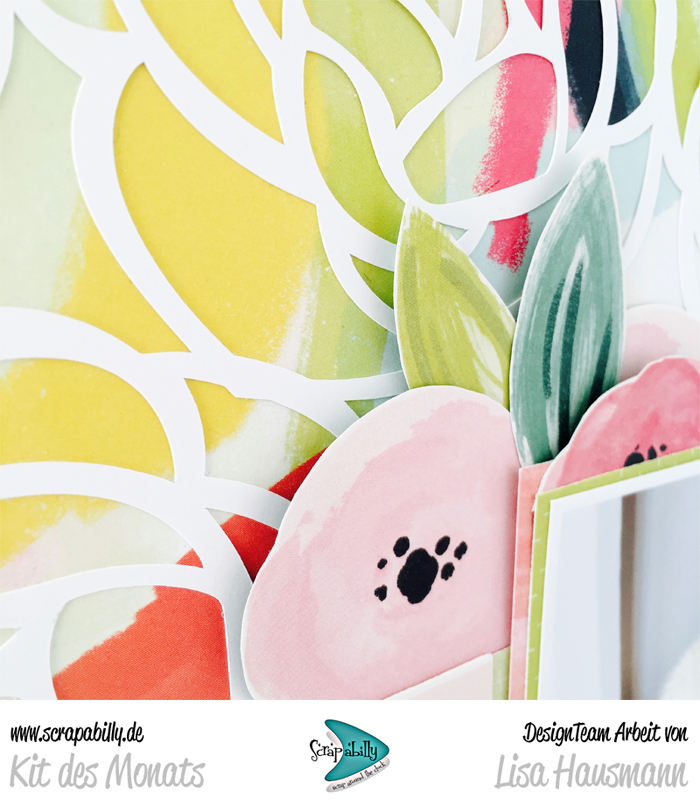
This next layout was in my mind from the very moment I first saw the papers. I knew that I wanted a full background die cut to show off the gorgeous colours and designs of this water colour paper. This time I really just couldn't cover up too many of those roses and tucked my story, photo and title into the corner leaving the roses to shine.


Of course, I couldn't resist a bit of fussy cutting too!


Last but not least is a page I've already shared over at Whimsical Musings for the prompt WM#213 inspired by the selfie.

I'd challenged myself to a month of selfies, managing a total of 25 in 30 days which wasn't too bad and which fit perfectly onto one 12x12 page. This allowed me to add a 12x6 for the title and journalling. There wasn't much else to add as the photos were pretty busy leaving little room for embellishment.


A simply beautiful kit and one that was so very inspirational.

You might be lucky to find one or two still available over at the Scrapabilly kit here and of course there is a gallery full of layouts and projects from the whole team. Go and be inspired!

Monday, 27 June 2016

June at Scrapabilly #1

This month at Scrapabilly, we were all thrilled to receive our Design Team kits full of the gorgeous, and rather difficult to come by over here, Fancy Free collection by Paige Evans for Pink Paislee.

Here's the kit photo and I have to admit that it was really hard to pick one side of the paper or the other sometimes. The Thickers in white as well as the mini sunny yellow alphas were perfect as I knew I wanted to be inspired by Paige Evans' style with her white backgrounds and sometimes longer titles.


Like I mentioned, I knew that I wanted to take Paige as inspiration and really go to town with stitching, paper "piecing" and get the Cameo going too. This first layout combines all those elements.

I cut up the square patchwork printed paper and then placed them to form a chevron going across the page, stitching each line down. I tied that in with some white cardstock rose die-cuts backed with some of the pink paper from the collection (#11) which I added in to the kit. 


It was difficult to justify covering up the papers but four small photos told the story I wanted to tell so I had to accept that not all the pretties would show!


Here you can see the pink paper backing the roses. It's subtle but still there if you look.


Next up was my idea of cutting out all the circles from paper #3 which made me realise there were definite colour groupings. Seeing the collection of blues and greens I decided that this would make a great banner and page background for a page about my wonderful nephew.

I also added in the pack of collection tags to my kit (tags here) and the puffy stickers (here) which really gave me a wide variety of items to add to my layouts.


I stitched up the circles to form a loopy banner along the top.


And the exclusive button seemed ideal here - both colour and sentiment!


And here is the other technique I did with the circles. I folded up all the pinks, reds and softer tones in half and then layered them back up into full circles again which I stitched along the middle. This allowed the sides of the circles to lift and you can peek inside. Great dimension without the bulk.

You can't really see her in this photo but the layout features our baby, our boxer dog Blossom who loved looking out of the window to see the world walk by (and barking loudly at them for the nerve of walking past our window), but especially waiting for me to come home from school. It was such a wonderful greeting at the end of a long day.


Come back on Wednesday for the second half of my Fancy Free Scrapabilly kit. It would be great to see you again.

LinkWithin

Related Posts Plugin for WordPress, Blogger...