Saturday 24 September 2016

Counterfeit Kit Challenge September member blog hop

I've been busy scrapping these last few days and am so happy to see you here today so that I can share with you.

You should have reached me from our wonderful follower Tina and if you've missed anyone along the way, I suggest you start at the beginning over at the Counterfeit Kit Challenge blog. We've got a new follower joining us today too - fellow Scrapabilly Design Team member Anne - so please make sure you head over there to say hello. The member blog hop is always such a great chance for us to connect with our followers and give some love for their gorgeous creations.

This month, the challenges over on the blog were:
Although as always, anything made with a Counterfeit Kit and not yet shared is game.

I got all excited and printed out four wonderful photos of my visit to the Kate Spade shop in NYC's Soho district and then realised that my Sundance kit wouldn't match my other NYC layouts. So now I have to make time to create that page another time.

But just to show you the gorgeous colours in that will inspire my page. This was a super challenge!


Instead, I switched direction and used this gorgeous sketch by Shimelle featured on this post for challenge #1.


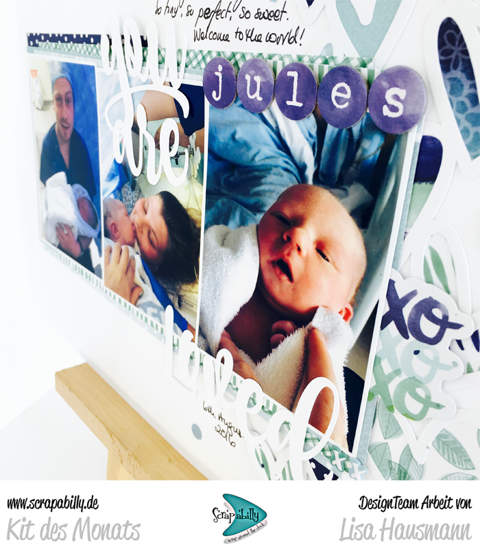
I was also really inspired by the layout based on the sketch by Gina Rodgers. All those gorgeous layers and bits and pieces. So I sort of loosely worked my layout around the sketch and the layout.

I liked the three distinct areas to include photos, title and words. As mentioned above, I was very inspired by Gina Rodger's layout and went with lots of layers and just two photos, reserving the middle section for my journalling and title.


Couldn't resist using this sweet washi tape even though it didn't match the rest of the layout so well.


I dipped some more of my letters and this up-close photo shows the that bubbles in the paint didn't give them a good surface, but I like the result enough to be happy with them.


This is layout #3 from my kit so far. It's a bit kit so you can expect to see more of these shades appearing in layouts in the weeks to come. October is a LOAD month, so I'm hoping to work my way through one or two of the four kits I still have on my shelf.

Thanks for dropping by. Let me know you were here!

Here's the full list in case you've got lost along the way or missed any of today's hoppers.

Friday 16 September 2016

Happy Blogiversary to me!

I knew it was coming so I checked out my post feed and yes, my 10 year blog anniversary is today.

10 years ago, 15th September 2006, I wrote my first "real" blog post about the start of our Nova Scotia adventure.

It's a badly written piece to be honest and includes no photos... I wrote it from the lobby of the hotel we stayed in at Frankfurt Airport before we headed over the ocean - in the days before wifi and smartphones. I was excited about the trip and excited to share my adventures online - using a fixed internet (modem perhaps) computer available for guests at the hotel - oh the pain of that slow connection. Of course, no one read me back then. I'm not surprised, like I said, it's badly written! But also, blogs were still relatively new back then in the UK and especially over here in Germany. Most people I mentioned it to had never heard of a blog. No one could see the point or why they should be interested.

I'd been scrapping since the start of 2006 and was still a painfully inexperienced newbie but it was exciting and fun and the industry was so much bigger then too. Was that the peak? Did I join the trend at the high point?

Anyway, 10 years on I'm wondering who's out there still reading blogs. Are they passé? Should we all consider giving them up in favour of the dreaded social media? I'm not sure but it's something I'm thinking about - what direction to take. Many people have stopped sharing through their blogs and I'm wondering if I'm just hanging on for the sake of it! But for now, I'm still here. I'm even thinking about an overhaul of the blog - design, layout and even the name. After all, I haven't lived in Recklinghausen for 7 years!

But all this is just a preamble for one of those shares...

This evening I made a layout to celebrate this milestone in my personal blogging journey and followed my own Whimsical Musings prompt WM#299 to be inspired by scrapbooking product made by a manufacturer that doesn't produce scrapbook product any more.

It had to be BasicGrey of course. In fact, this collection is one I treated to myself in that first year. It might even have been the first papers I ever bought. I ended up buying it twice I think. It's "dated" of course, but I still love it. And thank heavens that my style has changed considerably over those ten years so I tried to use some of the products in a more up-to-date way. I fussy cut and layered and roughed up the edges. I matched it up with some modern items such as gold mist, washi tap, Thickers and mini-alphas. Back in the day a BasicGrey collection consisted of papers, a sheet of alpha stickers (almost always the same font!) and a sheet of die-cut labels - non-sticky of course. I did find some remnants of the infamous matching BG fibres and really tried to find a way to use them on the layout - but no! 


I'm not totally convinced at how successful I was at bringing Urban Couture to 2016 but I do like the layout and isn't that what matters?

What's your opinion about the future of blogging? Should I be moving on to other mediums or continuing forward with a bit of a redesign? What's your own blogging adventure? I'm really interested to hear what you think as I carry on thinking about what I'm doing here.

Happy 15th everyone! Back soon with Simple Scrapper shares and a (no doubt) late 16 loves!

Saturday 10 September 2016

September at Scrapabilly #3

Back again with my final shares so let me remind you of the gorgeous Scrapabilly September Kit des Monats which includes elements from the Amy Tangerine Better Together collection. Packed full of beautiful shades of blue, aqua and green with a little rainbow thrown in for good measure.


My last layout to share today is a celebration of a new baby in the family. I wanted to keep this simple and use up some of the last scraps of paper from my kit so I used my Cameo to create a heart border which I then backed with various papers, picking out the blues and aquas to keep this layout a traditional boy colour scheme.


I kept the layout really clean and simple with lots of white space so that the photos could shine. He's so beautiful, he needs to be the main focus after all!


I also cut out the main title using my Cameo and it added a little dimension to this simple design.


I had a few scraps left and lots of die cuts (there's so many in the pack, it's hard to use them all up!) so I put together a few very simple cards.


I couldn't imagine using coffee cups and donuts on a layout so a card seemed a perfect solution. Not that I go out for coffee and donuts very often but you never know!


This die cut phrase was so lovely but again, I couldn't see me using it on a layout but it stands proud on this card.


After making these cards, I think I had about 3 square inches of the beautiful patterned paper left so I call that a great use of a lovely kit!

Check out the kit here on the Scrapabilly site to secure your own and don't forget to check out the Design Team gallery here while you're there. You can also find the Schnick Schnack Sack (embellishments) and the Pretty Planner Pack kits and galleries there too.

Thursday 8 September 2016

September at Scrapabilly #2

A reminder of the Scrapabilly September Kit des Monats using the Amy Tangerine Better Together collection.


Layout #3 uses one of my favourite sketches from Simple Scrapper via the premium membership. The large 5x5 photo centred on layers is one that I seem to have used several times over the months since it was first released (February - see my first layout with the sketch here). The large photo is ideal for a real eye-catcher such as my beautiful copper cups that we use round here for G&T!


These large ampersands seem to be a bit of a thing right now and I love to find ways to incorporate them meaningfully into my layouts. This was ideal for my title and I like how it frames one side of the journalling.


My Nuvo at work again. It proved successful to make a super smooth and relaxed swirl. I made it first on some acetate, removed it carefully after it had dried and then glued it down here. The metallic effect went really well with the copper cups in the photo.


And layout #4 was inspired by the "let's go" element as well as the small card and even the birds to some extent. As I'd just been over to the UK, I had some fresh homeward journey and Eurotunnel photos that record my habits as I return home.


I thought the two birds were perfect on a travel layout even though I suspect that they are really hummingbirds which, let's face it, are not very common round here!


Check out the kit here on the Scrapabilly site and don't forget to check out the Design Team gallery here while you're there. I love looking at the gallery to see all the different ideas we've come up with. You can also find the Schnick Schnack Sack (embellishments) and the Pretty Planner Pack kits and galleries there too. So much to discover and so much inspiration to be had.

Back soon with the last layout and some cards that I made from the kit. Hope to see you back then.
SaveSave

Tuesday 6 September 2016

September at Scrapabilly #1

Scrapabilly's September Kit des Monats features Amy Tangerine's Better Together collection with some fantastic shades of blue and green with a smattering of pink and rainbow for good measure! It was hard for me to decide on one side of the paper or the other with so many pretty water colour designs and plenty of ombré type effects. Here's the full kit and you can get yours over at the Scrapabilly shop here. In addition to the items in the kit, I also added in the matching puffy stickers and a sticker booklet. It was fun to add some dimension with the mini puffy stickers and the sticker booklet had loads of designs to choose from including a smaller alphabet which is always so useful for my longer titles.


Layout #1 keeps it simple with a page about my very first home grown tomatoes and talks about how I'm not the greatest gardener in the world and therefore am all the more thrilled to see these little wonders of nature ripening up on my balcony. And they are sooo delicious. It makes you realise just how tasteless so many are in the shops. 


I wanted to keep the main layout simple but give it a strong frame with the double border and some stitching. I repeated some simple stitching in the middle section too to bring it all together.


These circular Thickers are such a lovely shade of blue and the typewriter font is super cute. They were great to use although I did have to add glue to every single one!


A few splats of red ink and a hint of repeating red around the layout brings out the colour of the ripe tomatoes against all that white and blue.


For layout #2, I decided to try to pick out lots of pink or pinkish elements from the kit. I was surprised at just how much there was considering how the kit gives a cooler blue/green impression. It only seemed right to use all those pretty papers, cards, and embellishments for a page about Paige Evan's copic bookbinding class I attended last year down in München.


I love using the branding strips on my layouts to give a little extra pattern.


The clear die cuts can be tricky to attach but I usually just go for it with my tiny attacher and make that part of the design. A bottle of Nuvo was also included in the kit and you can see the mini dots I made with it. They take a little time to dry but I love the dimensional effect they give. The others on the Design Team were far more artistic with me with their own bottles of Nuvo so you should definitely check out their pages in the gallery (link below).


The clear die cuts are such a great way of adding a lot of interest and colour without all the bulk. The hand painted florals are so lovely that it was hard to use them all on one page - but they fitted it all so well.


And another close up of my Nuvo dots. A perfectly domed little dot.


That's my book there towards the right - with the ampersand at the top. I should probably add that into the journalling!


Check out the kit here on the Scrapabilly site and don't forget to check out the Design Team gallery here while you're there. I love looking at the gallery to see all the different ideas we've come up with. You can also find the Schnick Schnack Sack (embellishments) and the Pretty Planner Pack kits and galleries there too. So much to discover and so much inspiration to be had.


Back soon with more shares!

Sunday 4 September 2016

Forgeries on the Fourth

I had a go at two things this month in my Counterfeit Kit Challenge September kit, Sundance.

Now when I say, "I had a go", I mean that I picked out two items that are really simple and made a version of my own! I mean, really simple! 

I am not the Queen, or even Princess, of Forgery such as my good Master Forger friends, Leslie or Lesley. I leave the intricate, difficult, needing-lots-of-work and imagination stuff to them! I'm here to show you how simple can be simple.

First up was the geometric woodgrain and blue paper. According to Lesley's kit reveal on Thursday, that paper is actually made up of three blocks but I could only see two so I went with that!

I literally just cut up two sheets of paper and put them onto a backing sheet so that they lay nice and flat. Done. Less than five minutes but now I have a paper that I will use as a background for a layout and I really like the colours. In real life the blue is a lovely soft, sky blue - the only one I found in my stash.


Next up were the dipped alphas. More tricky. I had some wood veneer design Thickers and some cork too so I thought that I'd use those in my kit and have a try at painting and embossing them. As always, with mixed results.


First up I covered up the letters using washi tape to give me a clean line, leaving just under half showing.


I then used some acrylic paint to cover the exposed area. Either I have really thick paint, or my brush wasn't good enough but up close they show the brush marks. Maybe you could do better than me. The effect from a distance is great though! Depends how particular you are. 


Next up, I thought about using white embossing powder to give a smooth, glossy effect. That worked really well except I needed three or four layers to get that nice smooth surface and then when I took the washi off, the edge wasn't as clean as it should have been. Maybe you could find a way to get that line better because the effect up close and far away was great!


One last minute idea was on the table. I started thinking about those darn letters and how disappointed I was at the result. And then I thought about what they actually were - dipped letters. The secret's right there perhaps - dipping!

So I watered down some of my too-thick, white acrylic paint. Those bubbles caused a problem but if I'd had more time, I guess they would have dissipated. I was just in a rush to try out this last idea.


Then I once again picked out a couple of letters - one from each set of Thickers - wrapped washi tape around the same point of the letter and literally dipped them into the paint. I had to use a pin to pop the bubbles that were in the paint and also use the end of a paintbrush to go around the sides to remove the excess paint (perhaps it could have been even thinner) and then left them to dry.


Now, that looks much better. Still not quite perfect along that middle line but so much better. I might even give that another go as I come to a title I want to use.


My job here isn't to show you how perfectly I managed to forge these items, rather to give you some tips about how you might manage to make something similar in an easy way - even better than me! And to give you some hints about the mistakes I made along the way. I hope I've succeeded in inspiring you to give one or two items in the original kit a go.

Don't forget that we love it when you join in and make up your own kits. Share your kit and your creations over at our Link-Up page and don't forget the Member Blog Hop on the 24th. 

***** MEMBER BLOG HOP ***** 


Find out how below!  
Go on, you know you want to! 
Your project should be something new, using a Counterfeit Kit Challenge kit, that you haven't shown before and will only post for the hop. Be inspired by any of the challenges this month or just share something you've created with your kit. Remember, the more the merrier and it never fails to be a lot of fun! 
To be a part of our blog hop: 

  • E-mail us your name & blog address & promise to participate at thecounterfeitkitchallengeblog@gmail.com by the 18th September.
  • You will receive an e-mail from us by the 20th September with a list of the hop participants.
  • You will need to schedule your own blog post showing your project based on a challenge and link to the person after you in the hop.All Blog Hop posts will need to be scheduled to go live on the 24th September at 12:00am Mountain Standard Time (Arizona) but we will help you with the scheduling

LinkWithin

Related Posts Plugin for WordPress, Blogger...