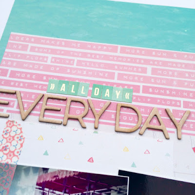
It's time to share my layouts (and 2 cards) made using the Scrapabilly July kit which is based around the Crate Paper Poolside and Journey collections.
Loads of paper (I managed 6 layouts and 2 cards, of which 3 layouts used paper as a background), collection stickers, matching die-cuts, a set of Thickers, mini-clothes pins, a Scrapabilly exclusive flair, twine, a bottle of Stickles and of course a selection of cardstock all added up to a fabulous mix of summer colours full of sunshine and inspiration.
There were all my favourite elements in here - sunny colours including lashings of pink and aqua; shiny gold and glitter; gorgeous alphas and some amazing paper designs.
Let me show you three of the layouts today and then the rest of the kit over the weekend. And don't forget you can get your own kit here and see what the rest of the Design Team made with their kit in the Scrapabilly gallery here.
I'm going to share the 3 layouts where I loved the paper so much that I decided that I just had to use it as a full background sheet.
This geometric ombre effect was first up and I just couldn't bear to cut it up at all - there were so many lovely small labels on the back but I could only bring myself to trim off a small border round the edge. I then cut out the same colours from the chevron design and contrasted it with some of the red and gold elements in the kit to create a nice mix. The diving lady paper was so cool that I completely made up this layout before going off to find a suitable photo that could be used. Not that I think that the photos must go with the papers. That's not really my style. But I wanted to draw attention to the cute diver so this photo of my sweet niece P waiting - probably impatiently - for her swimming session to start.
For this layout, I added in a gold doily but everything else is from the kit.
Next up was the pool water paper that also screamed to be used complete. So I listened to that inner voice and build my layout on the top.
Using the word paper, I decided to make one corner concentrate on hot and hot colours - this was the first time I went on such a sun holiday in high temperatures - and then the opposite corner represents the cool swimming pool water which I enjoyed so much.
As is the case for most of us who have photos from the 70s, they are imperfect with odd colours, faults down the edge of the print and hardly any suitable photos to show the story I want to tell. But there's the pool and there's my granddad who is the main character in my, yet to be written, journalling which is enough of a connection for me! Again, I held off writing the journalling because I want to really think about how to portray the feelings I want to record on each of those layouts.
And last but certainly not least, this map paper just needed to be used as one because it features London. How could I choose which tiny bit of that should be cut out? And it just so happened to show the corner of The Mall just opposite Buckingham Palace which reminded me of a photo I remembered from years before when I'd been there and the Queen had driven past. I think the Queen was on my mind a lot because she's been here in Germany at the same time. I need to add an arrow to highlight exactly where we were standing when she drove by.
I think I need more sheets of this paper...
That's it for now, but keep your eyes open for part 2. And just to remind you - you can get your own Scrapabilly kit here and check out the Design Team Gallery here.


These are lovely Lisa! Great work on all of them.Pretty kit too.
ReplyDeleteWonderful layouts Lisa! I love that Poolside Collection - wasn't crazy about it when I first saw it but then I saw a few pieces in person and I was hooked. I like the sticker sheet so much that I bought two and have almost completely used one of them already!
ReplyDeleteI love that first layout - the chevron piece that you cut is the perfect spot for the adorable photo. The stapled loops of twine and the die cut diver are great accents for your pool days photos and page. Your "royal" page is wonderful - its design really reminds me of a Shimelle page. Looking forward to seeing part 2!
Loving all this colors and that first layout is oh so pinnable. So I did.
ReplyDelete