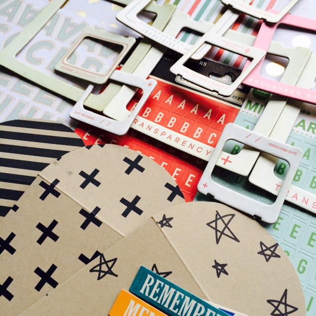
Over at the Counterfeit Kit Challenge, our inspiration kit by Scrappy Canary included some mini Maya Road kraft envelopes that I decided would be easy to forge given all the printables available online.
I've linked up a few printables and envelope tutorials over at the Counterfeit Kit Challenge blog today and decided to use the Kraft Paper Gift Card Envelope (link here) to make three for my original kit. You can see them at the bottom of the photo here.
While I love them, they are quite large and a little bulky because I used kraft cardstock. They are sturdy for sure but I'm not certain I will use them on a page.
So I wondered if I could get a bit more creative with the links I'd found and make something rather tiny to use on a page. I really liked the printed designs on those bigger envelopes so wanted to use that in a smaller format.
First off, I tracked down some standard brown wrapping paper and cut out some 8.5x11" sheets. They weren't exactly very flat but I flattened them down as much as I could.
I ran the sheets through the printer using the same printable as in my original kit. I had to tweak the paper through the printer as you can see here.
It looks super wrinkly but I wasn't too worried because I knew I was going to be cutting it right down.
As you can see here, the one print out is a bit smeary but again, I knew that I would be cutting the printed section down and that wouldn't be noticeable.
Then I printed out a template for some really teeny tiny envelopes - this is the Pinterest link here.
Then I used three of the templates and drew round them just inside the printed area of the larger printable. Here they are all folded and glued down.
And just so that you can see how big the original envelopes are compared to the latest mini ones here they all are laid out on a sheet of 12x12! I have to say, that I like both of them and hope to find a way to use them all up at some point - no doubt in different ways.
So there you go. Don't let predefined templates or printable limit how you create something in the style and size you'd prefer! I'm quite chuffed with my results. Let's see how well I manage to use them up!
Don't forget to check out the Counterfeit Kit Challenge today for lots of ideas for forging some of the items from the original kit. I happen to know that Leslie is going to wow you with her creation!!!
Tuesday, 4 August 2015
Saturday, 1 August 2015
Counterfeit Kit Challenge August kit reveal blog hop
It's the first of the month which means it's a whole four weeks of Counterfeit Kit Challenge fun!
Hopefully, you're here via the ever creative Leslie who has filled you with awe and wonder at the contents of her blue box and next up is the lovely Lynnette who has a great kit staging for her August collection. I have some insider information about that staging ;-) and it's another one you won't want to miss!
And don't forget that we are looking for new forgers! Is that you?!?! If you want to be part of the team and haven't applied yet then you are going to want to go back to this post here and get your kit made for us! We can't wait to see your creations!
We were given the Scrappy Canary June kit, Globe Trotter, as our inspiration kit for August which is what we'd say in German, "klein aber fein" meaning small but lovely! Full of the fabulous Pink Paislee Atlas papers and elements as well as other great elements, it appealed to me right away.
Here is my interpretation, Tripster.
And, as is often the case, the end result was nothing like the original plan I'd had! I have some of original Atlas papers and the Atlas frames so that's where I started... and then stopped! Back they all went into my stash and I headed in a completely different direction!
I decided to just note down some of the themes and motives of the original kit and take it from there:- travel, die cuts, frames, alphabet, words, spots, stripes, diagonals, arrows, envelopes. I included all the 12x12 papers I have in the October Afternoon Travel Girl range which covered the travel theme and then went out from there! Gold foil hearts and spots, arrows, spots and stripes and then a favourite sunburst paper which is newer than the other papers but seemed to match well. I was shocked to find that I had 13 papers!
Crate Paper frames were an easy add, along with alphabets in several sizes and colours and some kraft forged envelopes (more on the fourth).
I had a pack of travel themed die-cuts from Pebbles which I've had for some time so in they went. I love the colours and those cute arrows as well as those wonderful airmail items!
I had Travel Girl brads so I included those - I always forget to use them so here's my chance!
In the back of this photo, you can see a stamp set and there at the bottom is a sketch. I decided that I have to really use the sketches and inspiration offered by the super Kelly Purkey Sketchbook class, as well as the exclusive stamp set that was part of the course. So, all the course handouts have been printed and all the layouts I make with this kit will use one of the sketches and I'm going to try to use the stamps too.
This circle was the only item I found in my stash which was made of cork so I threw it in to cover the cork Thicker elements!
So there you have it. Another humungous kit which I'm determined to use up to the last scrap. Watch this space!
I created a Pinterest board for the original inspiration kit here so please feel free to use it if it helps you create your own version of it!
Thanks for dropping by and it would be lovely to hear what you think of my collection!
Next up is Lynnette so make sure you head over there and here's the full list of hoppers in case you get lost along the way.
Hopefully, you're here via the ever creative Leslie who has filled you with awe and wonder at the contents of her blue box and next up is the lovely Lynnette who has a great kit staging for her August collection. I have some insider information about that staging ;-) and it's another one you won't want to miss!
And don't forget that we are looking for new forgers! Is that you?!?! If you want to be part of the team and haven't applied yet then you are going to want to go back to this post here and get your kit made for us! We can't wait to see your creations!
We were given the Scrappy Canary June kit, Globe Trotter, as our inspiration kit for August which is what we'd say in German, "klein aber fein" meaning small but lovely! Full of the fabulous Pink Paislee Atlas papers and elements as well as other great elements, it appealed to me right away.
Here is my interpretation, Tripster.
And, as is often the case, the end result was nothing like the original plan I'd had! I have some of original Atlas papers and the Atlas frames so that's where I started... and then stopped! Back they all went into my stash and I headed in a completely different direction!
I decided to just note down some of the themes and motives of the original kit and take it from there:- travel, die cuts, frames, alphabet, words, spots, stripes, diagonals, arrows, envelopes. I included all the 12x12 papers I have in the October Afternoon Travel Girl range which covered the travel theme and then went out from there! Gold foil hearts and spots, arrows, spots and stripes and then a favourite sunburst paper which is newer than the other papers but seemed to match well. I was shocked to find that I had 13 papers!
Crate Paper frames were an easy add, along with alphabets in several sizes and colours and some kraft forged envelopes (more on the fourth).
I had a pack of travel themed die-cuts from Pebbles which I've had for some time so in they went. I love the colours and those cute arrows as well as those wonderful airmail items!
I had Travel Girl brads so I included those - I always forget to use them so here's my chance!
In the back of this photo, you can see a stamp set and there at the bottom is a sketch. I decided that I have to really use the sketches and inspiration offered by the super Kelly Purkey Sketchbook class, as well as the exclusive stamp set that was part of the course. So, all the course handouts have been printed and all the layouts I make with this kit will use one of the sketches and I'm going to try to use the stamps too.
This circle was the only item I found in my stash which was made of cork so I threw it in to cover the cork Thicker elements!
So there you have it. Another humungous kit which I'm determined to use up to the last scrap. Watch this space!
I created a Pinterest board for the original inspiration kit here so please feel free to use it if it helps you create your own version of it!
Thanks for dropping by and it would be lovely to hear what you think of my collection!
Next up is Lynnette so make sure you head over there and here's the full list of hoppers in case you get lost along the way.
Stephanie: http://skylinepaperie.blogspot.com
Susanne: http://snapsandsnippets.blogspot.com
Labels:
blog hop,
Counterfeit Kit Challenge,
DesignTeam,
inspiration,
Kits
Friday, 24 July 2015
Counterfeit Kit Challenge July member blog hop
Wow, that month went fast!
It was busy round here and I got to go travelling which was a lot of fun and resulted in my page for this month's Counterfeit Kit Challenge member blog hop page.
But more of that shortly. First up, you should have reached me via the lovely Roxie and I'm at the end of the hop so if you've missed any of it, you can go back to the Counterfeit Kit Challenge blog to start at the beginning or check out the full list at the end of this post.
This month we were given these challenges:
And, as I haven't been doing an awful lot of scrapping recently, I thought I'd give #1 and #2 a shot, combining more than 4 photos with an old tool.
The photos were easy. As I said, I just got back from a short trip over to London to meet a very good scrappy friend, Kathy all the way from the US and we had a blast running all over the city catching the sights. So all I had to do was collate some happy selfies for a great combination of 6 shots.
Then combining a few ideas I've seen around the net recently such as someone's horizontal grid - sorry I can't seem to identify which one in particular and I tend to make vertical grids so I know it stood out to me - and a beautiful layout by the very talented Ashley Calder, I decided to pull out my Fiskars scallop edge punch and create a little edge detail and pile up my 6 square photos along the bottom of the of the page.
Somehow most of the photos had a sort of soft, greyish-green look to them so they matched the products in this months Redux kit perfectly! (See my reveal here)
A little cluster of embellishments at the bottom combined a few different textures and elements.
This vellum card from Crate Paper was perfect to just add a hint of detail at the top of the page and house a few more elements.
There was twine and thread in my kit which I've stopped using so often so it was good to use three of them at once. I must remember to use this edge punch more often - I still love it!
All in all, this page came together really easily - fluke that the photos went with the papers and embellishments so well!
As I mentioned, I'm at the end the hop today but here's the full list in case you get lost along the way.
Don't forget to let me know you were here!
It was busy round here and I got to go travelling which was a lot of fun and resulted in my page for this month's Counterfeit Kit Challenge member blog hop page.
But more of that shortly. First up, you should have reached me via the lovely Roxie and I'm at the end of the hop so if you've missed any of it, you can go back to the Counterfeit Kit Challenge blog to start at the beginning or check out the full list at the end of this post.
This month we were given these challenges:
- Challenge #1: Picture This: Use at least 4 photos on your project
- Challenge #2: Old Tool Challenge: Dust off an old tool and get creative
- Challenge #3: Project Altering Experience: Include an altered embellishment
And, as I haven't been doing an awful lot of scrapping recently, I thought I'd give #1 and #2 a shot, combining more than 4 photos with an old tool.
The photos were easy. As I said, I just got back from a short trip over to London to meet a very good scrappy friend, Kathy all the way from the US and we had a blast running all over the city catching the sights. So all I had to do was collate some happy selfies for a great combination of 6 shots.
Then combining a few ideas I've seen around the net recently such as someone's horizontal grid - sorry I can't seem to identify which one in particular and I tend to make vertical grids so I know it stood out to me - and a beautiful layout by the very talented Ashley Calder, I decided to pull out my Fiskars scallop edge punch and create a little edge detail and pile up my 6 square photos along the bottom of the of the page.
Somehow most of the photos had a sort of soft, greyish-green look to them so they matched the products in this months Redux kit perfectly! (See my reveal here)
A little cluster of embellishments at the bottom combined a few different textures and elements.
This vellum card from Crate Paper was perfect to just add a hint of detail at the top of the page and house a few more elements.
There was twine and thread in my kit which I've stopped using so often so it was good to use three of them at once. I must remember to use this edge punch more often - I still love it!
All in all, this page came together really easily - fluke that the photos went with the papers and embellishments so well!
As I mentioned, I'm at the end the hop today but here's the full list in case you get lost along the way.
Don't forget to let me know you were here!
Gabrielle http://nomorelittlemonkeys.blogspot.com
Roxanne http://roxyrolla.blogspot.ca
Labels:
blog hop,
challenges,
Counterfeit Kit Challenge,
DT,
Kits
Sunday, 19 July 2015
Scrapabilly July kit shares - part 2
Back to share the rest of my creations using the Scrapabilly July kit featuring Crate Paper Poolside and Journey collections. You can find out more details about the kit either over at the Scrapabilly shop or in my first kit share post here.
Don't forget that the Scrapabilly gallery is full of further inspiration from the other Design Team girls.
Here's the kit - check out all those gorgeous summer colours.
I used a Simple Scrapper sketch for this one nd really liked the bold left hand border. Check out those gorgeous blue skies which I think work really well with the sunny colours of the kit. I added in the gold doily, a little gold twine/thread and of course, a splattering of mist.
I mentioned in my first share post that we had some fun cutting out flamingos from foam sheets when I was last at the Scrapabilly shop and I was determined to find a way to incorporate them onto my layouts. No, the Philippines do not have flamingos, but they are tropical and pink and fun and I thought I could get away with them here! I especially love that little heart that's created when the two heads meet!
For this one, I added in the flamingos and a handful of enamel dots - and mist of course! I couldn't help myself from using up all the little mini letter tiles on the sticker sheet in the kit! They are so gorgeous and the gold against the aqua goes with every element of the kit. I might need to buy another sheet. Perfect for adding extra titles or journalling substitutes!
And then the last layout seemed a perfect addition on a layout about Scrapabilly's Sylvia and how I'm so happy to have found such a good friend! The *F* for friend card seemed perfect for this too. The little bag held closed by that mini clothes pin will house my journalling. Leaving all the journaling for a quiet moment which seems elusive at the moment. I only added a few enamel dots and the flamingo to the kit for this layout. The journalling bag came with the kit and housed the embellishments. Love finding a way to use them.
So, another month, another gorgeous inspiring kit! Such fun.
Why not get one of your own from the Scrapabilly online shop here?
Don't forget that the Scrapabilly gallery is full of further inspiration from the other Design Team girls.
Here's the kit - check out all those gorgeous summer colours.
The kit was so inspirational for me and I created a total of 6 layouts and two cards. Success!
I used a Simple Scrapper sketch for this one nd really liked the bold left hand border. Check out those gorgeous blue skies which I think work really well with the sunny colours of the kit. I added in the gold doily, a little gold twine/thread and of course, a splattering of mist.
I mentioned in my first share post that we had some fun cutting out flamingos from foam sheets when I was last at the Scrapabilly shop and I was determined to find a way to incorporate them onto my layouts. No, the Philippines do not have flamingos, but they are tropical and pink and fun and I thought I could get away with them here! I especially love that little heart that's created when the two heads meet!
For this one, I added in the flamingos and a handful of enamel dots - and mist of course! I couldn't help myself from using up all the little mini letter tiles on the sticker sheet in the kit! They are so gorgeous and the gold against the aqua goes with every element of the kit. I might need to buy another sheet. Perfect for adding extra titles or journalling substitutes!
And then the last layout seemed a perfect addition on a layout about Scrapabilly's Sylvia and how I'm so happy to have found such a good friend! The *F* for friend card seemed perfect for this too. The little bag held closed by that mini clothes pin will house my journalling. Leaving all the journaling for a quiet moment which seems elusive at the moment. I only added a few enamel dots and the flamingo to the kit for this layout. The journalling bag came with the kit and housed the embellishments. Love finding a way to use them.
And just to finish off some of the scraps, I made up two summer greetings cards. I sprinkled Stickle spots over the lover edge and finished them off with a couple of left over die cuts and the Scrapabilly exclusive flair - which I can never get enough of!
So, another month, another gorgeous inspiring kit! Such fun.
Why not get one of your own from the Scrapabilly online shop here?
Saturday, 18 July 2015
Scrapabilly July kit shares - part 1
It's time to share my layouts (and 2 cards) made using the Scrapabilly July kit which is based around the Crate Paper Poolside and Journey collections.
Loads of paper (I managed 6 layouts and 2 cards, of which 3 layouts used paper as a background), collection stickers, matching die-cuts, a set of Thickers, mini-clothes pins, a Scrapabilly exclusive flair, twine, a bottle of Stickles and of course a selection of cardstock all added up to a fabulous mix of summer colours full of sunshine and inspiration.
There were all my favourite elements in here - sunny colours including lashings of pink and aqua; shiny gold and glitter; gorgeous alphas and some amazing paper designs.
Let me show you three of the layouts today and then the rest of the kit over the weekend. And don't forget you can get your own kit here and see what the rest of the Design Team made with their kit in the Scrapabilly gallery here.
I'm going to share the 3 layouts where I loved the paper so much that I decided that I just had to use it as a full background sheet.
This geometric ombre effect was first up and I just couldn't bear to cut it up at all - there were so many lovely small labels on the back but I could only bring myself to trim off a small border round the edge. I then cut out the same colours from the chevron design and contrasted it with some of the red and gold elements in the kit to create a nice mix. The diving lady paper was so cool that I completely made up this layout before going off to find a suitable photo that could be used. Not that I think that the photos must go with the papers. That's not really my style. But I wanted to draw attention to the cute diver so this photo of my sweet niece P waiting - probably impatiently - for her swimming session to start.
For this layout, I added in a gold doily but everything else is from the kit.
Next up was the pool water paper that also screamed to be used complete. So I listened to that inner voice and build my layout on the top.
Using the word paper, I decided to make one corner concentrate on hot and hot colours - this was the first time I went on such a sun holiday in high temperatures - and then the opposite corner represents the cool swimming pool water which I enjoyed so much.
As is the case for most of us who have photos from the 70s, they are imperfect with odd colours, faults down the edge of the print and hardly any suitable photos to show the story I want to tell. But there's the pool and there's my granddad who is the main character in my, yet to be written, journalling which is enough of a connection for me! Again, I held off writing the journalling because I want to really think about how to portray the feelings I want to record on each of those layouts.
And last but certainly not least, this map paper just needed to be used as one because it features London. How could I choose which tiny bit of that should be cut out? And it just so happened to show the corner of The Mall just opposite Buckingham Palace which reminded me of a photo I remembered from years before when I'd been there and the Queen had driven past. I think the Queen was on my mind a lot because she's been here in Germany at the same time. I need to add an arrow to highlight exactly where we were standing when she drove by.
I think I need more sheets of this paper...
That's it for now, but keep your eyes open for part 2. And just to remind you - you can get your own Scrapabilly kit here and check out the Design Team Gallery here.
Loads of paper (I managed 6 layouts and 2 cards, of which 3 layouts used paper as a background), collection stickers, matching die-cuts, a set of Thickers, mini-clothes pins, a Scrapabilly exclusive flair, twine, a bottle of Stickles and of course a selection of cardstock all added up to a fabulous mix of summer colours full of sunshine and inspiration.
There were all my favourite elements in here - sunny colours including lashings of pink and aqua; shiny gold and glitter; gorgeous alphas and some amazing paper designs.
Let me show you three of the layouts today and then the rest of the kit over the weekend. And don't forget you can get your own kit here and see what the rest of the Design Team made with their kit in the Scrapabilly gallery here.
I'm going to share the 3 layouts where I loved the paper so much that I decided that I just had to use it as a full background sheet.
This geometric ombre effect was first up and I just couldn't bear to cut it up at all - there were so many lovely small labels on the back but I could only bring myself to trim off a small border round the edge. I then cut out the same colours from the chevron design and contrasted it with some of the red and gold elements in the kit to create a nice mix. The diving lady paper was so cool that I completely made up this layout before going off to find a suitable photo that could be used. Not that I think that the photos must go with the papers. That's not really my style. But I wanted to draw attention to the cute diver so this photo of my sweet niece P waiting - probably impatiently - for her swimming session to start.
For this layout, I added in a gold doily but everything else is from the kit.
Next up was the pool water paper that also screamed to be used complete. So I listened to that inner voice and build my layout on the top.
Using the word paper, I decided to make one corner concentrate on hot and hot colours - this was the first time I went on such a sun holiday in high temperatures - and then the opposite corner represents the cool swimming pool water which I enjoyed so much.
As is the case for most of us who have photos from the 70s, they are imperfect with odd colours, faults down the edge of the print and hardly any suitable photos to show the story I want to tell. But there's the pool and there's my granddad who is the main character in my, yet to be written, journalling which is enough of a connection for me! Again, I held off writing the journalling because I want to really think about how to portray the feelings I want to record on each of those layouts.
And last but certainly not least, this map paper just needed to be used as one because it features London. How could I choose which tiny bit of that should be cut out? And it just so happened to show the corner of The Mall just opposite Buckingham Palace which reminded me of a photo I remembered from years before when I'd been there and the Queen had driven past. I think the Queen was on my mind a lot because she's been here in Germany at the same time. I need to add an arrow to highlight exactly where we were standing when she drove by.
I think I need more sheets of this paper...
That's it for now, but keep your eyes open for part 2. And just to remind you - you can get your own Scrapabilly kit here and check out the Design Team Gallery here.
Subscribe to:
Posts (Atom)