Back today to share another kit that I managed to kill off during LOAD514 :-)
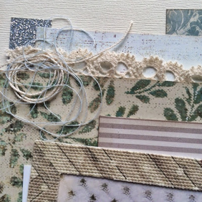
My Counterfeit Kit Challenge March kit, Balance, was a neutral-toned selection of partial sheets which I thought would be good for making some cards. In the end, I managed to make 6 full layouts and no cards at all. But it just worked so well when I wanted to have a softer background in contrast to the photo or maybe which helped support the theme of the page.
 |
| Balance kit, layout #4 LOAD prompt: Whoops! (a mistake) |
I was inspired to make this swirly twine banner from a Pinterest find but I can't find the source. If I track it down, I'll add the link.
The blonde was just one of many hair horrors during my teenage years - never again! Brunette and proud of it!
I love using sequins but sometimes struggle to attach them, managing to get glue everywhere, so when I came up with the idea of stapling them on individually I thought I'd give it a try. I like the effect.
I've used this baby photo time and time again but there are many stories to tell and so few photos that it always works. I also like the fact that the "spot" is so clear to see which supported my story. Having recently scanned many older photos, it was good to come up with a way of differentiating all those black and white baby photos!
 |
| Balance kit, layout #2 |
 |
| Balance kit, layout #3 LOAD prompt: "When I grow up..." |
 |
| Balance kit, layout #5 LOAD prompt: "If I knew then..." |
This one was just using up the last of the bits and pieces in the bottom of the kit box. As always, over the weeks that a kit is active, a few additional articles found their way in there (such as that black and cream spot) but they are all treated equally. Some kits "grow" considerably over their lifetime but that can keep them from being boring.
Well, this is the second time I've written this post due to the joys of limited technology so I'll sign off now.
Although my scrap style might usually be more colourful, I really enjoyed using this simpler palette for a change. What do you think about neturals?


You killed it beautifully as always Lisa.
ReplyDeleteSo much to look at, love how you've put the year inside the circle.
I think we've all done blonde at one time or another!!! Remember Sun In? Boy did that make your hair orange!
Love the colours :)
Beautiful pages, Lisa! I remember that twirly banner from LOAD. Your layers are just stunning. Thanks for being so inspiring!
ReplyDeleteBeautiful layouts and lots of details on all of them.
ReplyDeleteI am a great fan of neutrals and your use of texture really makes these pages stand out. I do what you do with twine!
ReplyDeleteThey are beautiful LOs. I struggle with neutrals. I find it hard to stop myself slipping into biegeocrity. I like a nice bright pop of colour.If I want a subtle look I tend to drift towards muted blues and greens rather than pure neutrals.
ReplyDeleteOh I adore the softness in these ... Just beautiful
ReplyDeleteI've always enjoyed looking at soft color palettes like this, but have never managed it myself. This post is a real primer on the art of it. Love these pages.
ReplyDeleteI never did blonde. But I did have some horrendous perms! I remember the blonde, and the seriousness of us in photos in those days. I think it was a new romantic thing? X
ReplyDeleteStapling sequins? Brilliant idea! Love the effect, too! Lovely layouts.
ReplyDelete