Just to remind you of the kit...
And my projects
 |
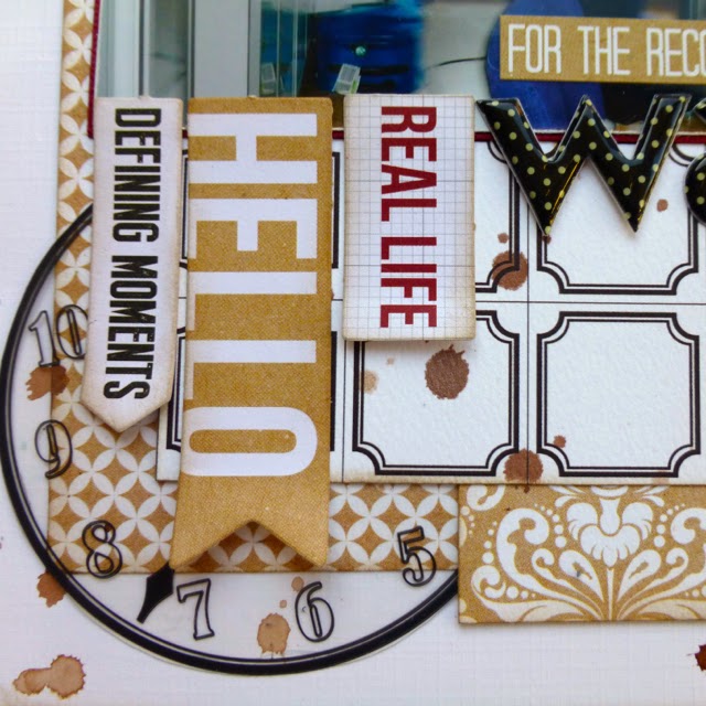
| The clock transparencies were perfect for this layout about how we gave Ted the shock in his life with a rather loud wake up call |
 |
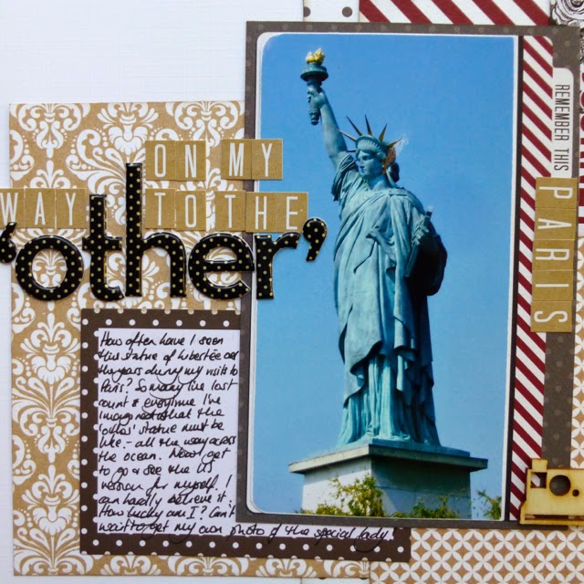
| I've now seen the "other" one and I have to say that it was just as beautiful and a lot more impressive but Pam thinks that the Paris lady has a prettier face. |
And I have to give you a hint that the kit for next month is already in my hands and it's really gorgeous! Totally different and I can't wait to cut into it. It will go live in the shop later in the month and the gallery should be ready to view at the end of the month so make sure you come back to check out what we've made.
Make sure you spend a few minutes to see what the rest of the Design Team have also done with this gorgeous Teresa Collins kit in the gallery (here) and on their blogs (find them on my sidebar). Charly is Guest Designer this month too and she's made some really lovely layouts so I really recommend grabbing a cup of coffee and settling down to spend some time in the gallery.


You're so talented to work with kits like this, your layouts are beautiful and inspiring !
ReplyDeleteGorgeous pages Lisa - I have this collection too - it's just fabulous!
ReplyDeleteAnd Part 2 certainly doesn't disappoint!
ReplyDeletethe "lady" layout is stunning - love all your cluster etc - may have to buy this collection after seeing what you and Jemma have done with it :)