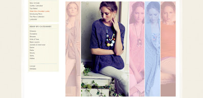
But anyway, last week Pam sent me the most gorgeous picture from Anthropologie for us to take inspiration from. I've heard and seen so much about this wonderful shop while online that I was thrilled to bits to find out that they now have a couple of stores in London and offer a Europe online shop. So, when I win the lottery, I'll be able to order myself some scrumptious goodies. I really recommend checking out the shop - such beautiful clothes and so well photographed. *sigh* ;-)
This is the inspiration photo.
 |
| Whimsical Musings Weekly Challenge #5 Inspiration from Anthropologie |
I thought about all sorts of different ideas for this one. Using the same photo several times with different photo effects on them, different coloured vellums, just multiple black and white copies of the same photo with one in colour, using strips of paper instead of photos but in the end, decided to just use up some of the photos I have but mute them down with standard vellum, leaving one on the top.
I like the result although I'm not sure about the bottom cluster. Pam has suggested I move it up to the bottom join between the main photo and the one of the left of it and I think that might work better. In the meantime, here is the layout as it is right now.
 |
| Whimsical Musings weekly challenge #5 |
 |
| Sketch courtesy of Page Maps September 2011 - Whimsical Musings Weekly Challenge #6 |
In the end it turned out unpretty and hopefully, a bit boyish instead of the pretty girlie layout I'd had in mind when I first saw the sketch!
 |
| Whimsical Musings Weekly challenge #6 and layout #1 for my September Counterfeit Kit "Departing Summer" |
I love the sketch so much that I think I am going to try it again using some of the more feminine bits from the kit.
Don't you just love using sketches?
Watch this space for a celebration coming up soon, and more from my Departing Summer kit using stamping techniques. What me? And stamping? Why, yes! I'm giving it a go!

Your vellum is really clever - it makes the other photo look so vibrant. That sketch still works as a boy page too - double bonus points for using so many brads! (How many DO you have?)
ReplyDeleteAwesome layouts!! I love seeing your inspiration!
ReplyDeleteI think both of these layouts are great. I like how you made your second layout unpretty and boyish. It still has a lot of little details, but not frills.
ReplyDeleteBoth pages are great - my fave is the first one. I'm always looking for different ways to do things with outdoor pages - the vellum is a really, really nice touch.
ReplyDeleteAbsolutely gorgeous! Love the vellum look!
ReplyDeleteI like the little cluster right where it is. And I just printed out the same page map to use today! I love page maps!
ReplyDeleteHello Lisa,
ReplyDeleteDuckienz here from LOAD and BPC. I saw that you're on the counterfeiting kit blog and thought I'd check out your site. I thought it might have been you based on the description then saw your photo and went "yup" lol. I will add you to my reader and stop by and say hello occasionally. I have been ill for the last few weeks so needing to get back into scrapping! See you 'round,
Allie
An Anthropologie catalogue arrived here out of the blue this morning! The clothes are gorgeous..but after seeing this I'll be going back to seen what layout inspiration I can glean!
ReplyDeleteGreat pages and I love that sketch:)
ReplyDeleteI'm taking part in Ginger's Mail Art Exchange, so popping over to say "Hi!"
Sketches are my favorite - and I think your take is great. And your take on the inspiration photo was wonderful as well! Wonderful use of brads also!
ReplyDeleteSTUNNING! I love love love the first layout!
ReplyDeleteI love how you can take a sketch and totally make it your own. Great pages!
ReplyDeleteSo SO pretty!
ReplyDeleteBrenda
theimperfectscrapper.blogspot.com