Rather, time for the Counterfeit Kit Challenge blog hop.
If you have just landed here, you might want to go back to our über-talented Guest Designer Kerri who kicks off the hop. And if you arrived via Kim, you are on the right track and at the end of my post, you can see a full list of the hoppers and your next stop, which will be Margie.
Happy hopping.
Our challenge this month was to dress up some stickers on our projects in honour of Halloween which is now just a few short days away. What will you be? Let me know in the comments as I'm collecting ideas for costumes for future spooky days to come ;-)
Anyway, our official remit was to alter some stickers and use them in an unexpected was on our project. Not as easy as it appears at first!
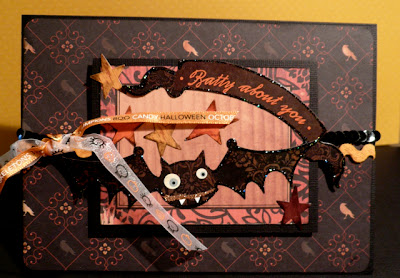
I decided to break out the Halloween kit I'd made this month, Schrecklich, and pretty up some of the CC stickers I had in there. Nothing ground breaking but adding a bit of glitter to the candy and stickles to the banner and the bat meant that the stickers were much more "me". Let's face it, glitter anything and it's instantly more "me" ;-)
I transformed the bat and the matching banner to a card and the candy found its way onto a layout featuring some of the pretty decorations I made for myself last year.
However, I did do one little thing on my layout which means that you won't even see my stickers on there! I made a title using the stickers as a mask. Black cardstock brushed over with some Stampin' Up Whisper White gives it a *bit* of a spooky look. This would have looked great with a white mist too but unfortunately I don't have one ;-( (adding it to my shopping list while I write!).
What will you do with your stickers? Do you use stickers a lot? Or more like me and just add them from time to time?
With that, thanks for stopping by and I will send you on your spooky way to Margie and the rest of the team.
Here's the full list:
Guest Designer - Kerri
Helen
Jemma
Jen
Jessica
Julie Ann
Kim
Lisa - you are here
Margie - this is your next stop
Milissa
Rebecca
Susanne
One last thing:

This month's sponsor over at CKC is Momenta. You can see their productshere, their YouTube channel here, and their great blog here.
In order to be eligible for their prize package for this month, all you need to do is:
- LIKE them on their facebook page (making sure you comment on their page to let them know that CKC sent you! )
- Send an email to CKC to let them know that you did this.
- Send a friend over too. You'll get an extra entry for each friend who also likes their page, comments on it and let's CKC know that YOU sent them!
Again, happy hopping!


I love the mask idea! I have a cream mist and it doesn't show up on nearly as many things as I thought it would. I need to buy white too.
ReplyDeleteLove the card and the sentiment LOL! The sticker masking on black is really effective too. TFS
ReplyDeleteYou can't go wrong with glitter (well I can - I always seem to smudge stickles!) The masking looks great - it's really effective, like a foggy night. Now I want ink pads AND mists!
ReplyDeleteI love that you blinged up your stickers. Such a fun way to alter them.
ReplyDeleteLove the sticker mask. Great idea for when you can't find that perfect color or are short a letter.
ReplyDeleteI love the masking idea! I always try to find masks in different ways, but I never think of the obvious - stickers! LOL! And never underestimate the power of simple - adding the stickles to your sticker sentiment really sets it off!
ReplyDeleteSuper cool idea with the masking of letters. It turned out fantastic! Thanks for sharing.
ReplyDeleteLisa, your page is so pretty - the colors are fantastic together!
ReplyDeleteOh wow your masked title turned out amazing!
ReplyDeleteLove all that layering on your LO and great idea with the 'mist'.
ReplyDeleteWhat a fabulous idea, I love making things more spooky!!!! And of course, I love glitter!!!!! Beautiful photos in your layout, yum!!!! xoxo
ReplyDeleteI agree, adding stickles to anything makes it more wow! I love your fun Halloween page and gorgeous fall page! The photos are outstanding!
ReplyDeleteGorgeous layout and card!! Love them!
ReplyDeleteLisa, this is gorgeous! LOVE the masking technique, and what a great way to use up old letters! Already a fan of your work, but I'm a follower now, too :)
ReplyDelete