The August Kit des Monats features Fancy Pants Dream Big collection and is full of beautiful soft colours, gorgeous motifs such as clouds and soaring birds, and is just all round lovely. The kit includes 6 collection papers, some mini alphas, a pack of collection die-cuts, a cute set of postmark stamps and some puffy word elements - also from the collection.
Here's the kit photo.
And here are my first three shares.
Layout #1 features an interesting find in Mainz that I discovered while exploring the city recently. The 50°N latitude line goes right through the city and they've marked this with a feature in the pavement. Anyone who knows me, knows that I love maps, atlas, and these markations so I was thrilled to record this. I kept this (and most of the layouts with this kit) simple to showcase both the kit contents and the photos.
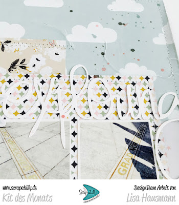
It was fun to get the sewing machine out to add some detail here and there as well as the Cameo to give me some additional titling options. This is one of my favourite hand-drawn words for a title and have no doubt used it before. But it seems to go with everything!
Second up is a layout featuring some photos I took in Paris in 2007 and a story from way back in the 90s. I don't have any suitable photos from back in the day - way before digital photography and the camera constantly in your hand, and even when I didn't even have my own camera - so it was a great way to link up the more recent photos with a story from the past.
I had a lot of fun stamping and fussy cutting out one or two of the postmark elements - and this was perfect with the Paris stamp - and clustering them up with the words and die cut elements to give detail and texture to the page without a lot of bulk.
This star paper was one of my favourites in the kit. In fact the stars, the map and the cloud papers just made me super happy and I could have made a dozen items with them.
This layout layout - for today - might seem a strange one. It features a photo of a large art photo that used to hang somewhere I used to work. The guys in the photo were my students and I loved the composition of the shot. I used the photo to record a few details about my appreciation for the art the company would commission and how great this particular piece was. It's especially special as I don't work there any more and often wonder what happened to these energetic, ambitious, young men from my class.
Some of the word elements from the die-cut pack seems particularly appropriate and again, my Cameo provided some pretty cool extras!
That's it for today. If you'd like to see more, I'll be sharing the remaining two layouts from this kit in a day or two. Come back for more details!
If you are interested in your own kit, and why wouldn't you be? - you can find it over at the Scrapabilly shop here. Perfect for dreamy, travel, exploration or simply fun-filled layouts.


Such pretty pages! I like the Cameo titles - they blend in perfectly yet are still readable too. This collection seems very light and airy and you kept that feature on your pages as well. I think the second one, with all that journaling, is my favorite of this bunch and it's great to pair an older story with a photo not taken at that same time.
ReplyDelete