Monday 30 May 2011

What words will you use?

LOAD is almost over :-( but our last week was all about journalling which proved to be quite challenging. I don't have so many problems with design or embellishments but sometimes, different styles of writing can be a bit difficult for me.

But as you know, almost all my pages have some sort of journalling - sometimes relevant to the photo, sometimes not - and therefore, I embraced this week and really tried to fulfil the prompts as far as I could.

It was a fun week bringing the month nearly to the end.

I noticed that it's been a bit difficult to keep the pace going through the whole month which made me bit sad. But when I look at my pile of layouts, it makes me feel good to have made the effort and not to have thrown in the towel on those days when it felt a bit much.

June will be a slower month for me but I am looking forward to putting together another Counterfeit Kit Challenge kit and playing along over there too. Somehow, I just couldn't get my act together to get involved there and LOAD at the same time.

Anyway, here's the last week:

22nd May

Journalling - use just one word for your journalling

Page Maps sketch

Now, this was a difficult one! It's almost easier to find a photo that doesn't need any journalling at all rather than a single word! I decided to support the idea with a single word title too and this photo of Cam just seemed to fit the bill. There is a bit more of the story than the fact that he had been waiting a loooong time for his first tooth to come out, and therefore, there might be another layout to come. But this photo just says it all for now!

BG Archaic is perfect for Cam with his wonderful red hair and these wonderful shades really bring out his hair and eyes - isn't he gorgeous?

23rd May

Journalling - journal hard times


I am not afraid of scrapping about the not too positive but I have been trying to put a more positive spin on everything recently so I was a bit nervous about this.

Then I saw photos of my school and the idea of contrasting the good and the bad of those times came to mind.  There was a lot of journalling so the design was kept simple.

24th May

Journalling - scrap your dreams, hopes, wishes


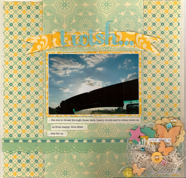
I have a lot of photos that I like too much not to print out but that don't really have any sort of reason to scrap them. Every now and again, I like to flip through them and find a meaning in them so that I can put them on a page. This is just such a photo. I loved the fact that the sun is peeping over the frame of the windscreen and the pretty blue sky and fluffy clouds.

It just made me think of sunny days.

Do you ever use photos that are a bit more metaphorical in meaning on your pages?

25th May

Journalling - create a page that gives a "telling detail"


This page didn't really turn out as I had wanted but I knew that this month, I wanted to scrap this photo. My MIL took the photo out of the front window of their mobile home while we were driving in Alaska during our Yukon adventure. And honestly, that is really OUR mobile home there at the end of the rainbow! What a catch.

I wrote about how luck was shining down on us during the whole of this holiday and that spur of the moment decisions we made turned out so perfectly. This is a little bit of the story of our holiday that I haven't scrapped before so I am pleased to have done it, even if the design is a little "off"!

26th May

Journalling - make a page about a small detail

Based on a Page Maps sketch

I've had these asparagus photos for ages and have been meaning to scrap this bizarre German tradition for some time. Today was the day. I have since reworked the last but one line adding the fact that I have now joined them in on their obsession! We are right in the middle of asparagus season and I need to stock up on it before they stop harvesting on 24th June!

I used papers from a Studio Calico kit I bought last year and some old MM felt letters (which tore apart really too easily and I had to piece them back together! Does that ever happen to you?!)

27th May

Journalling - use an older photo and journal about the different story that you can see when you look at that photo now that you couldn't see before


What I find about the prompts is that some days, as soon as I read them, I have a picture spring into my mind and I know exactly the story I want to tell. This was such a story.

Hindsight is a wonderful thing!

Ah, I was young and tanned and naive! Funny to look back and see that my life had only just begun!

28th May

Journalling - make a page about something you are passionate about


Anyone who knows me, knows that I am passionate about R and pretty passionate about our travels. We don't have many "real" holidays but try to make the effort to do mini-breaks and to make the most of any time away that we have. When I look at the list, it's pretty impressive! 

Again, another photo that's been hanging around for some time and another example of finding a reason to use it on a page. There's nothing really to say about the photo itself except that we were in Nova Scotia and that was an amazing holiday. 

It's been a great week and I'm surprised at how many one photo layouts I have made - not my usual style. I have broken into, and almost used up, an old kit as well as a lot of older products mixed in with some newer stuff.

A successful week I think. 

Journalling? How do you feel about it?

Friday 27 May 2011

Inspired by fashion

I'm still in the midst of LOAD madness so I thought I would just leave you with a very quick blog post with some layouts I haven't shared yet.

Well, they were shared in The Scrapbook Magazine but of course, I wait until they have been published to show them to you here.

I was asked to create two layouts inspired by fashion. What a great prompt and my mind went off in a million directions.

I instantly knew that I wanted to make a layout based on this window I had photographed at Christmas.


You might realise that I am ever so slightly obsessed with Chanel - if only I could indulge in real items other than perfume! But I fell in love with the window display while I was window shopping in Düsseldorf and thought it was so typically Chanel. Understated, classy but modern all at the same time. The combination of colours which are always connected in my mind with Chanel - THAT cream, black and just a hint of red. I knew that I wanted to use this as the basis for the first layout.


It was lovely to create something with these soft creams and natural beiges, with just a flash of bright from the photo and the title. The layout was very calming to make and I put a lot of work into finding just the right elements for my cluster.

The second layout was proving difficult to decide on until Liberty told me it was a total no-brainer and that of course, I should do a layout about our Prêt à Portea in London when we went for mum's birthday. It would be a bright, fun layout and a great contrast to the first one.

Thanks, Libby, for the push to make this one - I love it! It was a great feeling to just let go and chose all those elements relating to the colour and the theme. It took me ages, but I was very happy with the result.


What would you decide on if you were given this prompt?

Wednesday 25 May 2011

The children were nestled all snug in their beds...

... While visions of sugar plums danced in their heads.

I adore that poem. It sums up everything wonderful and special about Christmas, so when Jingle Belles posted this week's challenge from Amanda Profumo (Crafty Paper Girl) with the title "Visions of sugar plums", I knew it would be a wonderful prompt.

But to add even more scrumptiousness, we were given this style board that Amanda had discovered on one of her favourite blogs, Paperdoll Romance:


We could use any or all of this style board as a type of photo inspiration for our cards and there was so much to take in, I felt a bit overwhelmed. If I could have incorporated every single one of the photos into my design I would have. However, I was drawn to the colour, the name of the board itself, the old gold colour here and there, the bead droplet earrings, the snowflakes and the overall prettiness of all the photos together. I was disappointed not to have any tulle and will have to add it to my shopping list next time I am in town. 

Anyway, here is Jingle Belles challenge #21! 


I even added ice glitter to the letters to make them look a bit like sugar! 

Yippee for an already HUGE pile of cards!

Monday 23 May 2011

A little bit of this and a little bit of that

Embellishments are like scrapbook sprinkles and I love them. Which is why week three of this month's LOAD has been so much fun - each day a different embellishment prompt. The prompts are not your everyday, ordinary prompts and therefore, each day it got us thinking about how to interpret them.

It was a great week!

May 15th

Lain interviewed Stephanie Howell (have you checked out her amazing style here?) and I always think it's interesting to hear how others approach their scrapping and their inspiration and even their process. Stephanie was very inspirational for me and when I checked out her blog, I was blown away by the gorgeous layouts she creates.

Our prompt was to scraplift something from her blog or her TwoPeas gallery - what? only one?

It was hard to decide which one to use but in the end, this is the one I chose and I loved the simple layout, the banners, the doilies.


I have scrapped this photo before (probably more than once) but I thought it would look great against the woodgrain background. I finally broke into the last untouched Scrapagogo kit for this (sad that this is the last one!) and was thrilled with the products in there - gorgeous!

May 16th

Take a plain photo and match it with a plain background, then jazz it up with embellishments that help to support the emotion you wish to convey.

Ok, so you know that I don't really "do" plain. Just not really how I work but I tried! I chose a single photo that said something to me and then I matched it up with a selection of pretty papers from the Scrapagogo kit which then formed the basis of the layout.


I made a long title (something which seems to be a bit of a thing with me at the moment) and clustered a selection of embellishment goodies. I chose word stickers and then added a flower with a little camera, a window frame and a little wooden heart counter to enhance the "seeing the world" emotions. 

May 17th

Good page gone bad! 

Now this was a lot of fun. Lain suggested that we go back over some older layouts to find a layout that in principle is good, but somehow, the embellishments have turned it bad! 

When is the last time you looked at your older pages? Well, from experience I can tell you that some of them will make you cringe! But don't dispair, they were lovely at the time and this isn't an exercise to remake all of those pages but rather take one that can be enhanced by a bit of rework!


Although I think the original is a bit embarrassing (!), if you really want to look at it, you can find it here from when I first did it as part of a class. When I looked at it, I realised that the photo was a special one for me but the layout said NOTHING! The embellishments were totally superfluous and don't support what I wanted to say in any way and when I looked at it, I realised that I just hadn't told the story I wanted to. 

As it is, the journalling on the front of the reworked page is not the full story but I feel that a public toilet bonding story is perhaps best listed on the back! I have used more appropriate products and the little cluster at the top suggests some of what we saw on our trip while the little badge is perfect as my MIL spent the whole time terrified of the prospect of coming across bears!

May 18th

 Restraint. Keep it simple.

Yeah right! Me? No problem! Not!

Actually, this is another layout I fished out from my older albums as I felt the story wasn't quite what I had wanted to say. So I trashed the whole thing and just salvaged the photo and the small metal charms. 


I decided to use BG Capella with its soft colours to emphasise the soft shades of this white rose and just added some fussy cutting to the right as embellishment. I added the metal charms as a nod to the original even though I probably wouldn't have done this these days.

May 19th

Choose embellishments appropriate for the theme of the layout.

I don't know if I am running out of steam, but this week started to drag a bit and I was struggling to find photos that I wanted to deal with.

But after going through all my storage albums, this little story came to mind and I decided it was time to get it down on paper.


I deliberately didn't want to make this a Christmas layout because the "Christmas Tree Way" just refers to the route and it's the same whatever time of the year it is and even now as an adult think of it this way when I drive past it! So I used happy products and colours but added in the little string of lights from BG Eskimo Kisses that I jazzed up with multi-coloured bling (doesn't show up here because of the scan) and then some extra embellishments relating to time, travel and memories. 

May 20th 

Create a page by choosing the design first and making up the page before selecting and adding a photo and only embellish at the end of the process.

I decided to challenge myself to use this Sassafrass background paper which I considered to be a bit tricky. I really did make up the whole page including the photo mat before I went to have a look at the photos.


I wanted to create lots of layers and just piled stuff on until I thought the page was full enough! And there is a lot on this one, it's really quite a heavy one. Once I had found a photo which I thought could work, I added a small cluster and the banner title and called it done. The banner is a bit crooked which is something I need to work on - they always seem a bit skew-whiff.

May 21st

Use trendy products, techniques and designs but in a way that will not be out of date when you look back at it in the future.

Until I had started on this layout, I would have said that I wasn't such a trendy scrapper - somehow that sounds a bit negative - but it became clear to me that I must be.

I included banners, butterflies, doilies, clustering, ribbon roses, strip journalling, baker's twine and distressing. That seemed like a lot but it was all so natural for me - does this make me a bad person? 


I've decided that I adore this Scrapagogo kit - every little bit of it is gorgeous. (Actually, that's not strictly true - there is a piece of ribbon I don't like.) I shall be a bit sad when I get down to just the small scraps but I think I have a few more layouts out of it before I need to call it done.

And this week I've learnt that I adore embellishments and most of the time, can't get enough of them on my layouts.

What about you?

Friday 20 May 2011

A Colour Reference

As part of the Nic H BPC class "Colour! or is it Color?", there were weekly handouts to make up a small colour reference book. It was such a lot of fun to create a small 6x6 page to go alongside a full description of the colour with all the emotions it creates. 

You would have thought that I could have kept up with this during class, but true to form, I fell behind and soon only had 2 pages done when the class was already over. Typically, it sat on the side neglected and collecting dust for a while (ok, ages!) until I decided to pull myself together and get it finished. 

It's such a great little guide to all the rainbow colours and I included some other handouts Nic gave us regarding the colour wheel and different types of combinations. 

The front and back covers got full colour decoration using up lots and lots of bright, older scraps. How refreshing it was to just mix up colours and patterns, and slap it all on together to make something that is really a joy to look at.

It sits on my window sill which is right above my scrap desk and within easy reach if I want to have a look at the different colour wheel options. It's not that I use it very often, but when I do, it's a small, funky, self-made resource that makes me happy.

That's what it's all about after all!


Other layouts/posts I've written about this wonderfully colourful class can be found hereherehere, or even here!

** And the class is running again over at BPC - info can be found here - and I would really recommend it. Nic is a fantastic instructor and the handouts, assignments, videos and interaction with Nic are fantastic. Such a fun class. I'd love to do it all over again!

More from LOAD soon. Watch this space...

Wednesday 18 May 2011

St Nick is coming to call...

... well ok, maybe not for a few months but over at Jingle Belles he's making a guest appearance for this week's challenge, "Jolly (& lucky) Old St. Nick".

Something using Cosmo Cricket's sweet retro images and paper and within a few minutes, I was done!


When I look at that pile of cards ready to go, I am so excited that I will be all done and dusted by the time the nights start drawing in again.

In the meantime, enjoy the warmer, longer days and happy hump day!

ETA: I changed out the bottom banner to one stamped in dark brown instead of black - it looks much better. I am a bit annoyed with myself that I inked all the edges in black instead of brown too - the image is such a lovely shade that it would have looked better - learning point for next time! ;-)

Monday 16 May 2011

It's all about the colour

Week 2 of LOAD brought about a set of challenges and prompts around colour. Having recently done the Nic Howard's BPC class, "Colour! or is it Color?", this was interesting to build on what I had already learnt. 

It's been a very BRIGHT week! LOL! 

We listened to an interview with Lori Sawaya who is an expert in colour and she talked about how to create mood, enhance feelings or to give a message through your use of colour. Such a fascinating topic to think about.

February 8th

Enhance your layout using colour.

I am usually more comfortable using softer shades and muted colours but I had seen a layout in the gallery about Dubai and it gave me the idea to do one of my own. 

And I wanted to make it bright

Really bright. 

I'd bought this BG Marrakech paper back in 2009 specifically for this holiday so it was good to get it out and use it.  I wanted to concentrate on those wonderful shades of blue and green and this selection of papers seemed to really do that. 


February 9th

Using a colour grid (that describes you according to the colour you are connected to), select the colour that draws you first. 


I was of course, totally enchanted by the blossom pink here but when I started looking through my papers, a selection of green caught my eye so I went with that. I added some photos of our balcony and not much embellishment. The layout tells the story of how loud the country traffic (tractors and combine harvesters) is round here. There's not much to this layout but I have done the design before and I like that it uses several different patterns.


February 10th

Use nature's colours to create a scheme.

Normally, I would immediately have gone to browns and autumn colours. Without even thinking about it, this would be the way I would always go. 

But I was looking through my photos and saw these strawbs. Mmmm. They looked good and out of the corner of my eye, I saw the October Afternoon red polka dot paper and that was it. I remembered this gorgeous green paper (old Dream Street Papers, I think) which gave it such great contrast.

I used a Page Maps sketch and have since added another sprig of paper down the left hand side so that it goes to the bottom of the white. 

Not a me page at all, but I really like how different it is to my normal stuff.


February 11th

Go black and white. Photo, papers or both.

Another gulp moment for me. I often use b&w photos but not papers too often. But I had made a layout recently in basic black and white using my Conterfeit Kit and wondered about skipping this prompt. As in, "Done that already. tick."

But always one to face the challenge, I decided to give it a go after flipping through my papers and finding three or four I liked in shades of black and grey. I found a pretty photo and changed it to b&w too, even though it hardly had any colour in it anyway.

I've been enjoying making my own beaded pins as part of my clusters and thought the white pearls were ideal for this.


February 12th

Use a colour you don't normally use and mix in into your usual schemes.

I had seen so many orange layouts in the gallery, each one more lovely than the last and I decided that this could be an interesting colour for me to use. I rarely use orange at all, let alone a layout where orange was the main colour. I had bought these MM papers recently and tracked them down for this. I brought in my usual pink through the photos and the alpha.

Just some of the hundreds of photos I have of flowers I see, receive or grow (!). I adore the little wooden Studio Calico butterflies. I really think I need to get some more of the other designs they have. Gorgeous. And I broke into my Tim Holtz film strip too - far too nice to leave in the tin which is what I usually do.


February 13th

Take the colour direction from your photos.

Needing to even up the layouts I have been doing, I really wanted to do one of Cameron and when I saw these photos in my pile, I immediately thought of using reds and greys and had the perfect papers to go with that.

I don't find boy layouts easy to do, but these papers were easy to use once I got them out and moved them around a bit.

I need to get some more recent photos of Cam, he has grown SO much over the last couple of years but right here in these pictures, he is gorgeous! Such a sweetie.


February 14th

Create drama with the choice of colours, choosing them from as far apart on the colour wheel as possible.

Having done my strawberry layout earlier in the week, (and let's face it, that one is full of colour drama!), I decided that I didn't want to go extreme with this one. But blue and red are not exactly next to each other on the the wheel so it's not the most harmonious combination you can have.

I had seen a few Royal Wedding layouts in the gallery which prompted me to get going with mine. I had taken a couple of photos on the day of the TV and the flags outside and my scones - which by the way were the most delicious scones I have EVER tasted - Delia of course - and felt that I just wanted to keep it simple. I chose BG Boxer for this (going to be sad when this comes to an end as it is so versatile) due to the toned down reds and blues in the collection. 


So far, I have realised that I still love most of the products I have in my stash so my decluttering has been effective in thinning out what I have. I turn to BasicGrey over and over again, and I love almost every sheet I find in my hand - their products just really fit my style. 

However, I really need to start using up all my newer products that I have and get them onto layouts. This is such a bad habit of mine, to just keep them to look at. I have piles of new stuff and I find it so hard to just pick a sheet up and use it there and then. How crazy is that? Most people can't wait to use their new stuff but mine just sits there looking at me.

So next week, I really want to remember this. 

See you soon...

Friday 13 May 2011

Too busy scrapping for blogging...

Once again, I have entered into the fun of LOAD - one layout a day for the whole month. Yes, I am crazy! But yes, it is a lot of fun!

Lain is taking us Back To Basics with daily prompts covering different aspects of, well, the basics.

Week 1 was all about design basics starting off with an interview with Debbie Hodge of Get It Scrapped - really interesting to hear her talking about her process and thoughts when creating.


1st February

This first prompt was a really scary one. Make a layout using JUST the basics. Cardstock, paper, alpha, pen and photo. 

None of my usual embellishments? No creating embellishments from paper or whatever is lying around? No clusters? I nearly gave up there and then. But I flipped through my photos and found this sweet one of Maddie and thought it was a nice stand alone picture and the layout was born.

It was hard not to do more. Not to cheat! And I did a bit by using two alphas and lots of the different patterns of the papers but I kept to the spirit of the prompt and was satisfied for the first of the month - it always takes time to warm up.

The journalling talks about Maddie not being able to even sit up without falling over all these years and now she has found her niche as a natural talent at gymnastics - all that tumbling and flipping has found its place!

Using a Page Maps sketch

 2nd February

Contrast. Create a page using some sort of contrast - size, placement, number, colour etc.

I took these photos of the Cadbury factory a few years ago now, when I was back home with the car and decided to do a memory safari through the city. The journalling talks about my lifetime love of Cadbury's chocolate and the connection I have with the company due to its location just up the road from where I lived for many years.

I created contrast by using the large photo paired up with the smaller photos. The larger photo is also more attention grabbing because of the colour and the stark, white lettering.


3rd February

Emphasis. Draw emphasis to some element of your page.

I have so many gorgeous photos of the children that I need to do a lot of non-specific pages to get them used up, so this was ideal for me to do a "What I love about this photo..." layout. I think this is my third in this newly developed series of pages (just doing them when a photo really grabs my attention like this one). I just wrote up a few lines about what a lovely, kind, thoughtful girl Maddie is. 

I emphasised the photo by only using the one and by matting it with a strong red to draw in the colour of her dress. I used some very precious papers (Emma's Shoppe - Crate Paper) that Libby had sent me as a surprise before Easter. Such a wonderful paper range. Loved it although now I am a bit sad that I have so little of it left.


 4th February

White space. Create a page with "white space" which in my book is usually everything that you can find UNDER my papers and embellishments! Another toughy for me but I was up for the challenge because I had done this design last year and loved it. I am scraplifting myself all the time at the moment - makes it so easy.

A rather old photo of baby brother Ted. And using up some even older product from BG (Stella Ruby) which was a bit scary as I opened a never-before-opened collection pack and then only used five 1" strips of paper. Obviously, I need to work on using up more of it.


5th February

Visual triangle

I lifted myself again for this simple double spread and forgot all about the visual triangle until I had finished it only to realise that I had done it anyway. Must be an automatic thing for me - the triangle or the diagonal.

I have so many photos of my time in Tuscany (Siena is featured here) that this style of double layout is ideal to use up quite a few at once. I used BG Periphery which I had originally got for these photos so I was happy to get some used up here. Only nearly 4 years after the trip.


Close up of left hand side

Close up of right hand side. I think I will be adding something there in the middle of the right hand edge - it looks a bit blank and empty. It might have to wait until the end of LOAD though.

6th February

Alignment/common margins

Something that is almost impossible for me as a rule across the page but I try to do it for photo mats and block positioning which is what I did here. 

I wanted to use some bright papers and designs for these photos of adorable Isabella just to lift the whole thing and halfway through, decided I didn't even like these BG Sugar Rush papers. But I decided to continue through to the end and it ended up better than I thought it would. I particularly like the lace paper background over the white cardstock which seems to pop.

Just a silly layout featuring the Belly!


7th February

Scraplift - get inspiration from the layouts of others. Galleries, books, magazines, self, whatever.

Being part of the Flickr group means that I get to mark all of my favourites so that I can find them again later and look through them for inspiration. This layout is based on one of my favourite scrappers, TheLinarStudio, although her style is completely and utterly different to mine. She goes large with a lot of her photos and her layouts are stylishly minimalist. Something I can't manage but which is still very inspirational for me.

I took her basic design and made it a Lisa layout by adding some bits and pieces. It was a great way to use this A4 sized photo of Ted in his Oliver production a few years ago and I journalled about how proud we were of his performance.

Love, love, love BG Boxer. Such a wonderful set of patterns and papers.


A good first week all in all, although I am finding it hard to get into the rhythm of the daily scrapping.

My May counterfeit kit has yet to be made up, never mind make an appearance and it might be forgotten now until next month. But I am really happy to be using up stash and even opening up old, untouched collections.

Now I just need to even up the subjects of my layouts - Cameron, Joe, Amber, us...

LinkWithin

Related Posts Plugin for WordPress, Blogger...