Saturday, 10 September 2016

September at Scrapabilly #3

Back again with my final shares so let me remind you of the gorgeous Scrapabilly September Kit des Monats which includes elements from the Amy Tangerine Better Together collection. Packed full of beautiful shades of blue, aqua and green with a little rainbow thrown in for good measure.


My last layout to share today is a celebration of a new baby in the family. I wanted to keep this simple and use up some of the last scraps of paper from my kit so I used my Cameo to create a heart border which I then backed with various papers, picking out the blues and aquas to keep this layout a traditional boy colour scheme.


I kept the layout really clean and simple with lots of white space so that the photos could shine. He's so beautiful, he needs to be the main focus after all!


I also cut out the main title using my Cameo and it added a little dimension to this simple design.


I had a few scraps left and lots of die cuts (there's so many in the pack, it's hard to use them all up!) so I put together a few very simple cards.


I couldn't imagine using coffee cups and donuts on a layout so a card seemed a perfect solution. Not that I go out for coffee and donuts very often but you never know!


This die cut phrase was so lovely but again, I couldn't see me using it on a layout but it stands proud on this card.


After making these cards, I think I had about 3 square inches of the beautiful patterned paper left so I call that a great use of a lovely kit!

Check out the kit here on the Scrapabilly site to secure your own and don't forget to check out the Design Team gallery here while you're there. You can also find the Schnick Schnack Sack (embellishments) and the Pretty Planner Pack kits and galleries there too.

Thursday, 8 September 2016

September at Scrapabilly #2

A reminder of the Scrapabilly September Kit des Monats using the Amy Tangerine Better Together collection.


Layout #3 uses one of my favourite sketches from Simple Scrapper via the premium membership. The large 5x5 photo centred on layers is one that I seem to have used several times over the months since it was first released (February - see my first layout with the sketch here). The large photo is ideal for a real eye-catcher such as my beautiful copper cups that we use round here for G&T!


These large ampersands seem to be a bit of a thing right now and I love to find ways to incorporate them meaningfully into my layouts. This was ideal for my title and I like how it frames one side of the journalling.


My Nuvo at work again. It proved successful to make a super smooth and relaxed swirl. I made it first on some acetate, removed it carefully after it had dried and then glued it down here. The metallic effect went really well with the copper cups in the photo.


And layout #4 was inspired by the "let's go" element as well as the small card and even the birds to some extent. As I'd just been over to the UK, I had some fresh homeward journey and Eurotunnel photos that record my habits as I return home.


I thought the two birds were perfect on a travel layout even though I suspect that they are really hummingbirds which, let's face it, are not very common round here!


Check out the kit here on the Scrapabilly site and don't forget to check out the Design Team gallery here while you're there. I love looking at the gallery to see all the different ideas we've come up with. You can also find the Schnick Schnack Sack (embellishments) and the Pretty Planner Pack kits and galleries there too. So much to discover and so much inspiration to be had.

Back soon with the last layout and some cards that I made from the kit. Hope to see you back then.
SaveSave

Tuesday, 6 September 2016

September at Scrapabilly #1

Scrapabilly's September Kit des Monats features Amy Tangerine's Better Together collection with some fantastic shades of blue and green with a smattering of pink and rainbow for good measure! It was hard for me to decide on one side of the paper or the other with so many pretty water colour designs and plenty of ombré type effects. Here's the full kit and you can get yours over at the Scrapabilly shop here. In addition to the items in the kit, I also added in the matching puffy stickers and a sticker booklet. It was fun to add some dimension with the mini puffy stickers and the sticker booklet had loads of designs to choose from including a smaller alphabet which is always so useful for my longer titles.


Layout #1 keeps it simple with a page about my very first home grown tomatoes and talks about how I'm not the greatest gardener in the world and therefore am all the more thrilled to see these little wonders of nature ripening up on my balcony. And they are sooo delicious. It makes you realise just how tasteless so many are in the shops. 


I wanted to keep the main layout simple but give it a strong frame with the double border and some stitching. I repeated some simple stitching in the middle section too to bring it all together.


These circular Thickers are such a lovely shade of blue and the typewriter font is super cute. They were great to use although I did have to add glue to every single one!


A few splats of red ink and a hint of repeating red around the layout brings out the colour of the ripe tomatoes against all that white and blue.


For layout #2, I decided to try to pick out lots of pink or pinkish elements from the kit. I was surprised at just how much there was considering how the kit gives a cooler blue/green impression. It only seemed right to use all those pretty papers, cards, and embellishments for a page about Paige Evan's copic bookbinding class I attended last year down in München.


I love using the branding strips on my layouts to give a little extra pattern.


The clear die cuts can be tricky to attach but I usually just go for it with my tiny attacher and make that part of the design. A bottle of Nuvo was also included in the kit and you can see the mini dots I made with it. They take a little time to dry but I love the dimensional effect they give. The others on the Design Team were far more artistic with me with their own bottles of Nuvo so you should definitely check out their pages in the gallery (link below).


The clear die cuts are such a great way of adding a lot of interest and colour without all the bulk. The hand painted florals are so lovely that it was hard to use them all on one page - but they fitted it all so well.


And another close up of my Nuvo dots. A perfectly domed little dot.


That's my book there towards the right - with the ampersand at the top. I should probably add that into the journalling!


Check out the kit here on the Scrapabilly site and don't forget to check out the Design Team gallery here while you're there. I love looking at the gallery to see all the different ideas we've come up with. You can also find the Schnick Schnack Sack (embellishments) and the Pretty Planner Pack kits and galleries there too. So much to discover and so much inspiration to be had.


Back soon with more shares!

Sunday, 4 September 2016

Forgeries on the Fourth

I had a go at two things this month in my Counterfeit Kit Challenge September kit, Sundance.

Now when I say, "I had a go", I mean that I picked out two items that are really simple and made a version of my own! I mean, really simple! 

I am not the Queen, or even Princess, of Forgery such as my good Master Forger friends, Leslie or Lesley. I leave the intricate, difficult, needing-lots-of-work and imagination stuff to them! I'm here to show you how simple can be simple.

First up was the geometric woodgrain and blue paper. According to Lesley's kit reveal on Thursday, that paper is actually made up of three blocks but I could only see two so I went with that!

I literally just cut up two sheets of paper and put them onto a backing sheet so that they lay nice and flat. Done. Less than five minutes but now I have a paper that I will use as a background for a layout and I really like the colours. In real life the blue is a lovely soft, sky blue - the only one I found in my stash.


Next up were the dipped alphas. More tricky. I had some wood veneer design Thickers and some cork too so I thought that I'd use those in my kit and have a try at painting and embossing them. As always, with mixed results.


First up I covered up the letters using washi tape to give me a clean line, leaving just under half showing.


I then used some acrylic paint to cover the exposed area. Either I have really thick paint, or my brush wasn't good enough but up close they show the brush marks. Maybe you could do better than me. The effect from a distance is great though! Depends how particular you are. 


Next up, I thought about using white embossing powder to give a smooth, glossy effect. That worked really well except I needed three or four layers to get that nice smooth surface and then when I took the washi off, the edge wasn't as clean as it should have been. Maybe you could find a way to get that line better because the effect up close and far away was great!


One last minute idea was on the table. I started thinking about those darn letters and how disappointed I was at the result. And then I thought about what they actually were - dipped letters. The secret's right there perhaps - dipping!

So I watered down some of my too-thick, white acrylic paint. Those bubbles caused a problem but if I'd had more time, I guess they would have dissipated. I was just in a rush to try out this last idea.


Then I once again picked out a couple of letters - one from each set of Thickers - wrapped washi tape around the same point of the letter and literally dipped them into the paint. I had to use a pin to pop the bubbles that were in the paint and also use the end of a paintbrush to go around the sides to remove the excess paint (perhaps it could have been even thinner) and then left them to dry.


Now, that looks much better. Still not quite perfect along that middle line but so much better. I might even give that another go as I come to a title I want to use.


My job here isn't to show you how perfectly I managed to forge these items, rather to give you some tips about how you might manage to make something similar in an easy way - even better than me! And to give you some hints about the mistakes I made along the way. I hope I've succeeded in inspiring you to give one or two items in the original kit a go.

Don't forget that we love it when you join in and make up your own kits. Share your kit and your creations over at our Link-Up page and don't forget the Member Blog Hop on the 24th. 

***** MEMBER BLOG HOP ***** 


Find out how below!  
Go on, you know you want to! 
Your project should be something new, using a Counterfeit Kit Challenge kit, that you haven't shown before and will only post for the hop. Be inspired by any of the challenges this month or just share something you've created with your kit. Remember, the more the merrier and it never fails to be a lot of fun! 
To be a part of our blog hop: 

  • E-mail us your name & blog address & promise to participate at thecounterfeitkitchallengeblog@gmail.com by the 18th September.
  • You will receive an e-mail from us by the 20th September with a list of the hop participants.
  • You will need to schedule your own blog post showing your project based on a challenge and link to the person after you in the hop.All Blog Hop posts will need to be scheduled to go live on the 24th September at 12:00am Mountain Standard Time (Arizona) but we will help you with the scheduling

Thursday, 1 September 2016

Counterfeit Kit Challenge September kit reveal blog hop

It's September and time for the new Counterfeit Kit Challenge kit reveal, this month chosen by Margie.

Hopefully you've arrived here from Leslie's gorgeous Blue Box reveal and next up is the ever inventive Lynnette and her wonderful staging. However, the full blog hop list is at the end of the post and you can go back to the Counterfeit Kit Challenge blog to make sure you catch the whole hop. And I'm delighted to welcome Nicole Mackin as our Guest Designer. A seasoned kitter and a much loved YouTuber, we are thrilled to have her with us this month so make sure you say hello!

This month, Margie has given us the Felicity Jane August kit which is full of beautiful, exclusive products in wonderful, summery colours proving that summer is most definitely still in full swing at the CKC blog :-)

(Even if I'm longing, ever so slightly, for autumn to make an appearance!)


Here's their mood board for the kit.


Here's my kit bringing summer to an end in my neck of the woods. I originally wanted to call it Sundown and then realised that Sundance summed up that end of season feeling much better!


As Felicity Jane kits only use exclusive FJ items, I knew I was going to have to do some serious matching and that I wouldn't have a specific starting point.

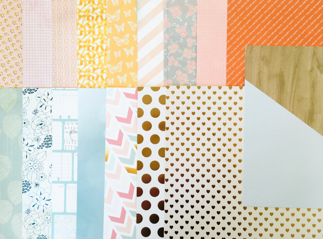
And that is where I started really. I just grabbed piles of paper and looked for papers with colours which seemed to match the inspiration kit to some degree. I had to stretch my understanding of orange, coral, pink and blue a little so that I had enough papers. This is when I realised that I am missing blue paper and products. All the blues I found were a touch lilac, teal or aqua which is definitely not the original blue in the FJ kit. That's why there is a bit of a mix of tones. I tried to match up some of the designs on the papers and used gold foil sheets for the spots and hearts. The geometric blue and veneer paper is a simple forgery that is much more blue in real life and one that I'll feature in Forgeries on the Fourth.

Yes, there are a LOT of papers! I've blown my own "rules" out of the water this month, and when you think that most of them are double sided (with totally different colours), my guess is that many pages will not look like they come from the inspiration kit!


Again with the embellishments, I knew that I was just going to have to match them up by type and colour rather than specific items because they are all exclusives. So I added in doilies, flair and some veneer/doily stickers.


Some pocket page cards instead of a cut apart sheet, some strips of wood veneer and vellum so that I can cut, punch or just use as and when I need it.


I included some confetti which matches the original and then some glitter tags and two brand new washi tapes just because I thought they were pretty and would work well in the kit.


A wood veneer pocket card matches the large heart on one of the journalling cards in the original kit and then I included Thickers which have a dip technique (more in Forgeries on the Fourth). And then I spotted this cute sheet of flamingo and pineapple "sprinkles" which I picked up recently. It doesn't really match the kit at all, nor is similar to anything in the original kit but I just wanted to give myself an excuse to use them!


I am missing die-cuts and couldn't find anything in my kit that gave me the same feeling as the FJ kit so I decided to leave them out for now. If something catches my eye, I'll be throwing them in. A couple of smaller alphas and a partially used sticker sheet completes my kit.


It's HUGE but I like it and think it will be easy to use. I know I'm going to need to add some more embellishments in as I start using it but that's ok. My kits tend to develop organically across the month so this will just be a little more of that.

Thanks for dropping by today. It was lovely to see you! Hope you let me know you were here and let me know which colour you think you need more of in your stash?!?

Here's the full blog hop list and next up is the delightful Lynnette, give her some love from me too!


Don't forget that we love it when you join in and make up your own kits. Share your kit and your creations over at our Link-Up page and don't forget the Member Blog Hop on the 24th. 

***** MEMBER BLOG HOP ***** 


Find out how below!  
Go on, you know you want to! 
Your project should be something new, using a Counterfeit Kit Challenge kit, that you haven't shown before and will only post for the hop. Be inspired by any of the challenges this month or just share something you've created with your kit. Remember, the more the merrier and it never fails to be a lot of fun! 
To be a part of our blog hop: 

  • E-mail us your name & blog address & promise to participate at thecounterfeitkitchallengeblog@gmail.com by the 18th September.
  • You will receive an e-mail from us by the 20th September with a list of the hop participants.
  • You will need to schedule your own blog post showing your project based on a challenge and link to the person after you in the hop.All Blog Hop posts will need to be scheduled to go live on the 24th September at 12:00am Mountain Standard Time (Arizona) but we will help you with the scheduling

LinkWithin

Related Posts Plugin for WordPress, Blogger...